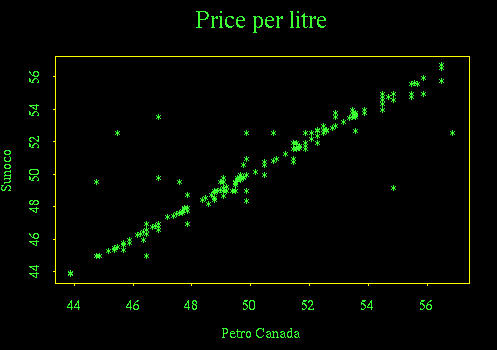
Plotting the Sunoco series against the Petro Canada series shows that the prices at the two stations are the same or nearly so on most days (strong diagonal); there were a few days when Sunoco was much higher then Petro Canada (points above the diagonal) and even fewer when Petro Canada was higher than Sunoco (points below the diagonal).
This plot suppresses all time information such as seasonal effects and day of the week effects, but it does show that the two series are so highly correlated that we may not have to study both of them.
The next plot is a time sequence plot of daily Sunoco prices. I could only get Splus to display Julian date, not calendar date.
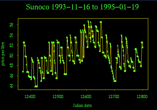
The strongest features of this graph are: the seasonal cycle (highest in summer, lowest in winter), the creep-down-jump-up cycle that takes about 5 to 10 days, and a price war (an unusually long sequence of drops with no rise) in the fall of 1994.
The time sequence plot suggests that consecutive days may be correlated. This can be investigated with a lag-1 autocorrelation plot, where price each day is plotted against the price on the previous day.
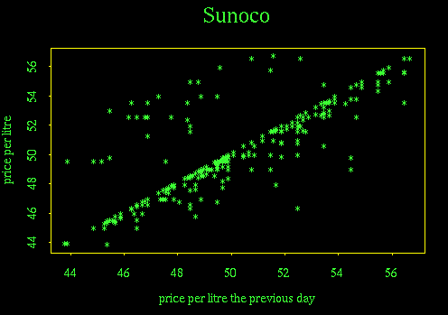
This plot shows that the price usually stays the same (points on the diagonal) or drops slightly (points just below the diagonal), but occasionally jumps up (points above the diagonal are fewer in number than points below, and they are all some distance from the diagonal). While this graph gives no information about seasonal effects, seasonal effects account for much of the scatter in the plot.
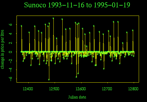
We can remove the seasonal effects in order to see the creep-down-jump-up cycle more clearly, by working with the price changes. Because observations were made first thing each morning, the price on day i+1 minus the price on day i is the amount the by which the price changed on day i. The time sequence plot of differences is like the time sequence plot of prices but with seasonal variation removed. Note also that the price war is still visible on this plot, but much less prominent.
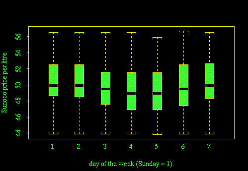
A box plot of price against day of the week shows that the median price dips slightly on Wednesday and Thursday but, because these data are for all seasons combined, the drop in median is too small, relative to the total variability, to be of any use in forecasting when the price will be low.
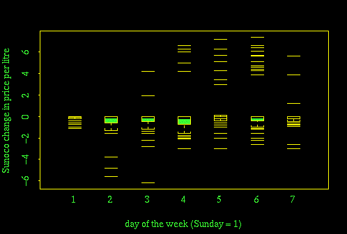
Plotting change in price, instead of price, removes seasonal variation and gives some insight into the station's price-changing strategy. On Sundays, the price usually stayed fixed; on a few Sundays it went down a little, but it never rose. On Mondays, the price never rose but on a few occasions it went down a lot. Thursday and Friday were the most common days for price hikes, and so on.
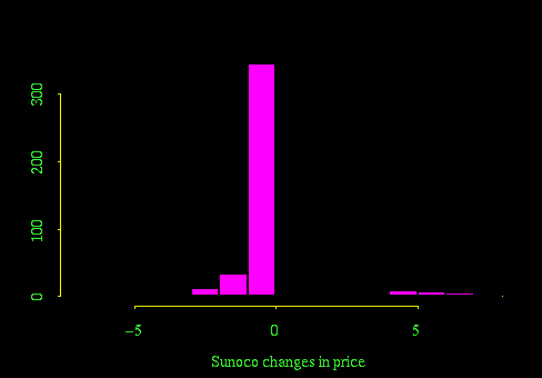
The histogram of price change gives a similar story, but because it is plotted for all the days combined, it doesn't show the interesting day of the week differences. The strong peak at zero is the dominant feature of the histogram but isn't particularly interesting.
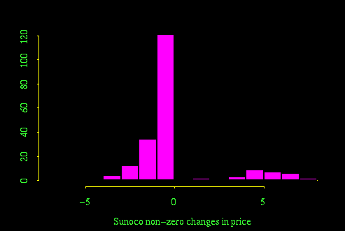
Removing the zero changes before plotting the histogram enhances the more interesting parts of the plot, but doesn't make it any more useful.
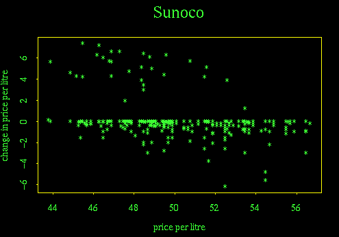
The final plot in the exercise doesn't tell us anything we didn't already know. In particular, when the price is at a record high it isn't likely to jump higher, and when the price is at a record low, it isn't likely to go any lower, so the shape of the graph is not surprising. The plot reconfirms the creep-down-jump-up nature of the 5-to-10-day cycle within the seasonal cycle.
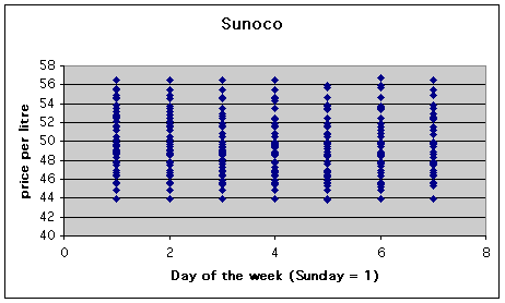
You should have been able to get graphs like these from MINITAB, SPSS and Excel, with the exception of the box plots which are not a standard chart in Excel. It is possible to make them using the Excel Volume-Open-High-Low-Close stock chart but it isn't much fun. A simple alternative, not as good as the box plot, is to recode the day of the week as a number (Sunday = 1) and do an X-Y plot with numerical day on the X-axis. The plot of Sunoco price versus day of the week then comes out as follows. Because the points all run together, it isn't so clear where the median and quartiles of each distribution are.
So what can we conclude about which is the best day of the week to buy gas? We have seen that whatever the price was on a Sunday morning, the price never rose and sometimes dropped between then and the next Tuesday morning. So there was no advantage to buying gas on Sunday rather than waiting until Monday afternoon or Tuesday morning. Later in the week there was a greater chance that the price would go up, especially if it was already unusually low for that time of year.