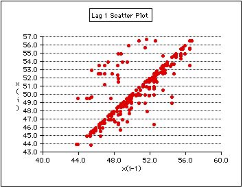
The data are strongly autocorrelated. Price was most likely to stay the same on successive days (most points lie on the diagonal). When prices went up they leapt up (points above the diagonal are some distance from the diagonal), when they went down they crept down (most points below the diagonal are not far below the diagonal).
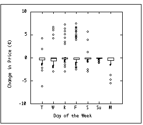
The price rarely changed on a Sunday, and if it did it would only go down a little. On Monday, the price usually stayed the same or dropped slightly, but on a few occasions it went down a lot. On Tuesday the price usually stayed the same or dropped a bit, but on two occasions it jumped up. Saturday was like Tuesday. Major increases were reserved for Wednesday, Thursday, or Friday, Friday being the most common day for a jump up. This plot is very informative, it reveals some of the dynamics of the pricing system.
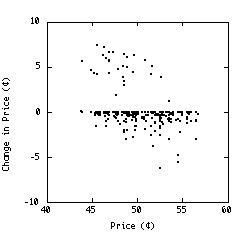
The price usually stayed the same (most points lie on the abscissa). If it changed, it either leapt up or crept down. It was more likely to leap up when it was low than when it was already high. The few occasions when it made a large drop occurred when the price was already higher than average.
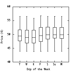
The median price was lowest on Wednesday and Thursday, but the variation is too great for this fact to be of any practical use. One reason there is so much variation here is that price varies seasonally (see the Time series Plot below).
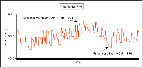
Over periods of one to three weeks, the price typically fluctuated over about a 6¢ range.There was also seasonal variation, with average summer prices being about 6¢ higher than average winter prices. There was a price war from mid-September to early October.
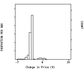
The price usually stayed the same, or dropped slightly. When it went up it usually jumped by about 4¢ to 6¢.