Updated 1998-04-08
The table below gives the average annual power consumption (in kwh) for each combination of dehumidifier brand and level of humidity. Click here to see the original data and the ANOVA results.
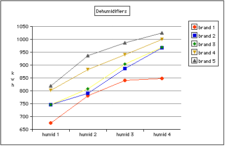
The first graph plots the means against brand for each level of humidity. The four lines have much the same shape, but different average levels. In the ANOVA this shows as an insignificant interaction but a significant effect of humidity. Note that we would not normally draw a line chart when the x-axis is strictly categorical. In this plot, there is no natural ordering of the five brands but connecting them from left to right with lines makes the plot easy to read. It also helps in this example that the brands happen to be labelled from the lowest power consumption to the highest. If the brands were labelled in any other order, the four lines would be just as parallel to each other but they would be going up and down.
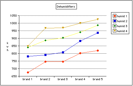
The second graph plots the means against level of humidity for each brand. The four lines have much the same shape, but different average levels. In the ANOVA this shows as an insignificant interaction but a significant effect of brand. (Actually, the shape of the Brand 1 line is a bit different from the others, in that it responds less to the highest level of humidity, but not different enough to make the interaction significant at the 5% level.)
|
Dehumidifiers |
humid 1 |
humid 2 |
humid 3 |
humid 4 |
|
brand 1 |
675.5 |
780.5 |
840.5 |
847.5 |
|
brand 2 |
746.0 |
789.5 |
886.0 |
968.0 |
|
brand 3 |
746.5 |
807.0 |
904.0 |
968.5 |
|
brand 4 |
801.0 |
883.0 |
940.5 |
999.5 |
|
brand 5 |
818.5 |
936.0 |
986.0 |
1025.5 |