Here are the graphs, calculations and discussion I am looking for; you may think of others that are also helpful in interpreting the data.
Full marks = 70
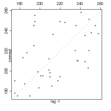
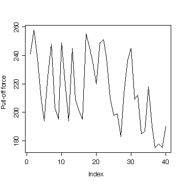
Follow the instructions in the text and also do a lag-1 scatter plot. Is there evidence of trend or autocorrelation?
The time sequence plot suggest a constant mean pull-off force for the first 20 or so connectors, followed by a downward trend. This suggests that the connectors later in the sequence are weaker.
The lag plot (a plot of the time series against a lagged version of itself) indicates weak positive autocorrelation. That is, the points lie more or less along the diagonal but do not lie tightly along the diagonal. If there were a strong positive autocorrelation, two connectors tested one after the other would have similar values of pull-off force and the points on the lag plot with lag +1 or -1 would lie very close to the diagonal.
The stem and leaf plot shows two modes. We can see the same effect in the time sequence plot; the high values of pull-off force are all close to 245 and most of the low values are close to 195.
  The decimal point is 1 digit(s) to the right of the |

  17 | 558
  18 | 357
  19 | 00445589
  20 | 1399
  21 | 00238
  22 | 005
  23 | 5678
  24 | 1555899
  25 | 158
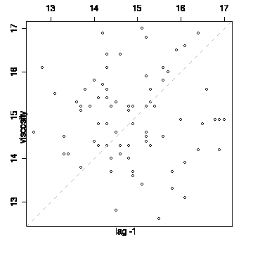
Follow the instructions in the text and also do a lag-1 scatter plot. Is there evidence of trend or autocorrelation?
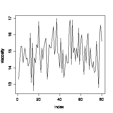
The time sequence plot shows a fairly consistent variation with no indication of trend.
The lag plot shows a wide scatter of points, not concentrated on the diagonal, so there is no evidence of autocorrelation in these data.
The mean of the first 40 observations is 14.88, which is very close to the mean of the second 40, which is 14.92. The difference is small compared to the sample standard deviation (which is 0.948 for the first 40 and 1.02 for the second 40, or 0.98 overall), supporting the claim based on visual inspection of the time sequence plot that there was no evidence of a change in the process after the first 40 observations.
> mean(viscosity[1:40])
[1] 14.875
> sqrt(var(viscosity[1:40]))
[1] 0.9483454
> mean(viscosity[41:80])
[1] 14.9225
> sqrt(var(viscosity[41:80]))
[1] 1.022939
> mean(viscosity)
[1] 14.89875
> sqrt(var(viscosity))
[1] 0.9803763
The attached data file gives measurements of trace elements (vanadium, iron, and beryllium, all in % ash) and hydrocarbons (saturated and unsaturated, both in % area) in chemically analyzed samples of crude oil from three zones of sandstone (Wilhelm, Sub-Mulinia, Upper Mulinia). The data are listed in an arbitrary order within each zone.
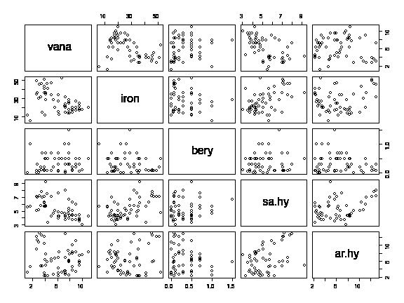
Use a scatterplot matrices to study relations between the variables and use histograms to assess normality. Use box plots to look for differences between the zones. State your conclusions. Why would time series plots and lag-1 plots be inappropriate for these data?
The scatterplot matrix reveals weak linear relationships between iron and saturated hydrocarbons, and between saturated hydrocarbons and aromatic hydrocarbons, but no other pairwise relationships are evident.
It might be worth drawing scatterplot matrices for the three zones separately.
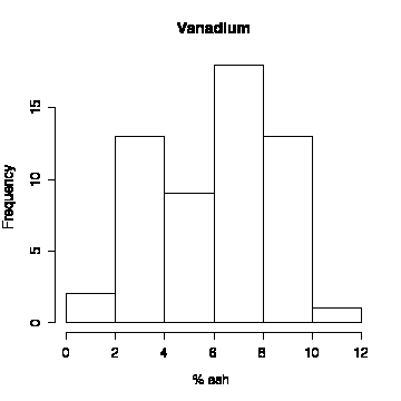
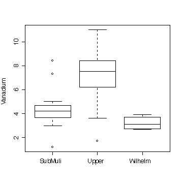
Considering the small sample, the histogram of vanadium content could have come from a normal distribution, but when we inspect the box plot that breaks down this distribution by zone, we realize that the left tail of the histogram comes mainly from Sub-Mulinia and Wilhelm, while the right tail is mostly Upper Mulinia. It would make sense to plot histograms for each zone separately, but the sample sizes within each zone would be very small and you wouldn't learn much more than the box plot shows.
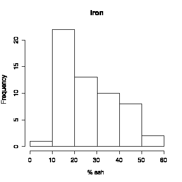
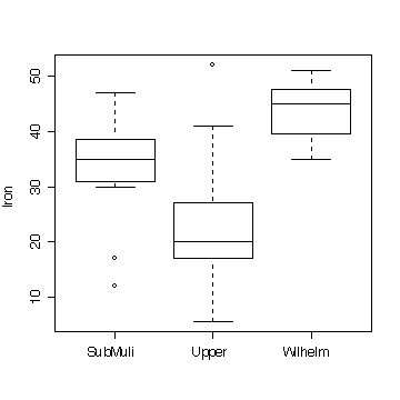
The overall distribution of iron content is positively skewed. The Upper Mulinia zone has lower iron concentrations than the other zones.
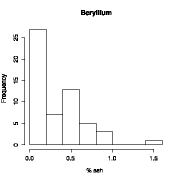
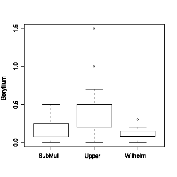
The overall distribution of beryllium content is positively skewed. The Upper Mulinia zone has higher beryllium concentrations than the other zones, and two unusually high values (outliers on the box plot).
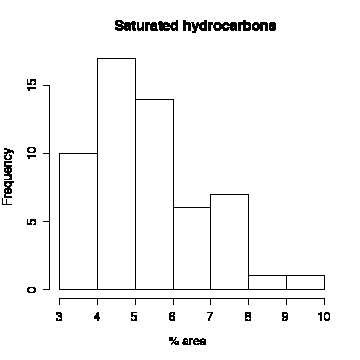
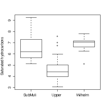
The overall distribution of saturated hydrocarbons is positively skewed. The Upper Mulinia zone has lower saturated hydrocarbons than the other zones.
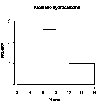
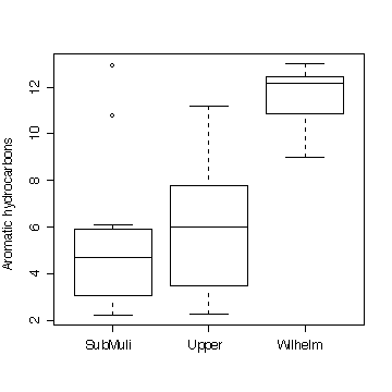
The overall distribution of aromatic hydrocarbons is positively skewed. The Wilhelm zone has lower aromatic hydrocarbons than the other zones.
Since the data are listed in an arbitrary order within each zone, there is no reason for adjacent observations to be more closely related to each other than observations further apart, so time series plots and lag plots would be inappropriate.
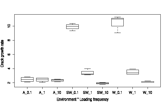
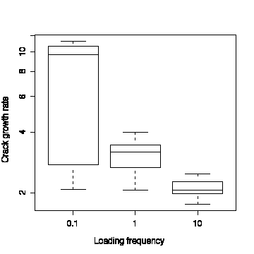
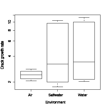
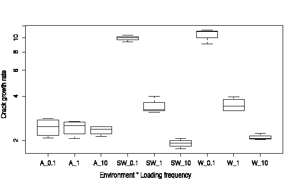
Do graphical analyses using comparative box plots to compare crack growth rates between the three frequencies, between the three environments, and between the nine different combinations of frequency and environment. Repeat using the log of crack growth rate. State your conclusions. (The question asks for a test of hypothesis and an analysis of residuals but you are not expected to do those for this assignment.)
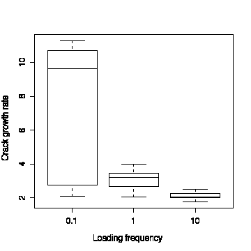
Loading frequency of 0.1 gives a much wider range of crack growth rates than the two higher frequencies; the highest frequency gives a consistently low growth rate.
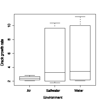
This result appears strange; in the Saltwater and Water environments, the crack growth rate can be as low as it is in Air, or it can be much higher. There isn't much difference between the Saltwater and Water environments.
Looking at all 9 combinations of Environment and Loading Frequency separately, the confusing result of the previous box plot is explained. Crack growth rate is relatively low in Air at any loading frequency. In Water or Saltwater the growth rate is the same as in Air at loading frequency 10, it is a bit higher at loading frequency 1, and much higher at loading frequency 0.1.
In the jargon of factorial designs, this is called an "interaction"; the effect of loading frequency is different in different environments.
Taking logarithms pulls in the high values and stretches out the low values, making positively skewed distributions more symmetric. Applied to the preceding box plots, it doesn't change the first two graphs very much, but the third one, with the 9 combinations of Environment and Loading Frequency shown separately, shows a more equal spread in the 9 distributions. (This will be important later; the standard analysis of a factorial design requires each treatment group to have the same variance.)
Note that in R we can specify a logarithmic axis with original units. In other packages, we may have to define a new variable as the log of crack growth rate and the Y-axis will be linear in logarithmic units.
Note: In this course, log is always natural logarithm.