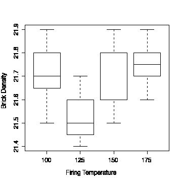
To create the comparative box plot, use density for the y-value and temp for the x-value in the box plot dialogue box in MINITAB or SPSS.
  density      temp
      21.8       100
      21.9       100
      21.7       100
      21.6       100
      21.7       100
      21.5       100
      21.8       100
      21.7       125
      21.4       125
      21.5       125
      21.5       125
      21.9       150
      21.8       150
      21.8       150
      21.6       150
      21.5       150
      21.9       175
      21.7       175
      21.8       175
      21.7       175
      21.6       175
      21.8       175
Here are the R commands to read these data from a text file "bricks.txt" into a data frame bricks, display the data, and draw the comparative box plot. Note how split() is used to split the brick density measurements into the four different temperature categories.
> bricks <- read.table("bricks.txt", header=T)
> bricks
   density temp
1     21.8  100
2     21.9  100
3     21.7  100
4     21.6  100
5     21.7  100
6     21.5  100
7     21.8  100
8     21.7  125
9     21.4  125
10    21.5  125
11    21.5  125
12    21.9  150
13    21.8  150
14    21.8  150
15    21.6  150
16    21.5  150
17    21.9  175
18    21.7  175
19    21.8  175
20    21.7  175
21    21.6  175
22    21.8  175
> boxplot(split(bricks$density, bricks$temp), xlab="Firing Temperature", ylab="Brick Density")