The marking scheme is indicated in red. Full Marks = 50.
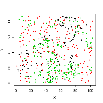
You were not asked to look at the X-Y relationships but many of you did a graph like this one to see where the trees are located in the plot. It is interesting that the cedars (black) and hemlocks (green) are clustered while the Douglas fir (red) are distributed more uniformly over the plot.
Note that I used attach() to attach the data frame forest to the workspace; then I can refer to the variables directly, X rather than forest$X, species rather than forest$species, etc.
> attach(forest)
> plot(X,Y,col=as.numeric(species),pch=20)
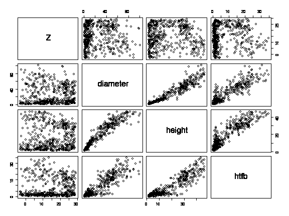
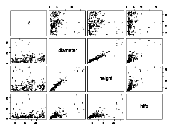
A scatterplot matrix of the three variables of interest shows no apparent relationship between elevation and diameter, height or height to first branch; a well-defined but slightly curved relationship between diameter and height; and a somewhat less clear but possibly linear relationship between height and height to first branch.
> pairs(forest[,5:8])
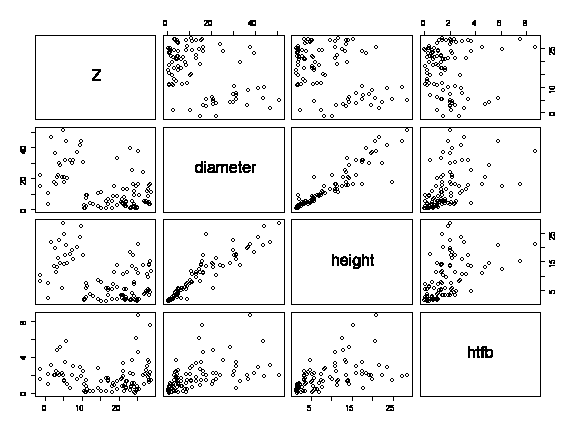
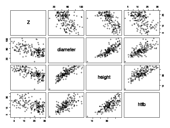
Colour-coding the points (black cedars, red Douglas fir, green hemlock) reveals much more information: the diameter, height and height to first branch of hemlocks and cedars is not related to elevation, there are no small Douglas fir, and with Douglas fir there is an inverse linear relationship between elevation and diameter, height or height to first branch, with the largest Douglas firs tending to be found at the lower elevations. The nonlinearity in the diameter-height relationship observed in the previous graph can be explained by differences between species; the relationship is linear within each species.
> pairs(forest[,5:8],col=as.numeric(species))
If you didn't colour-code, you should draw the scatterplot matrix separately for each species. Here, for example, is cedar.
> pairs(forest[species=="CD",5:8])
here is hemlock
> pairs(forest[species=="HL",5:8])
and here is Douglas fir.
> pairs(forest[species=="DF",5:8])
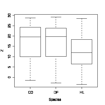
The boxplot of elevation by species shows that cedars and Douglas fir are found over the same range of elevations, but hemlocks are more frequent at lower elevations.
> boxplot(split(Z,species),ylab="Z",xlab="Species")
The box plot of diameter by species shows that the Douglas firs are much larger than the cedars and hemlocks. Similar results were found for height and height to first branch.
Note that there are some hemlocks and cedars with the first branch on the ground, and there are several hemlocks with very high first branches.
> boxplot(split(diameter,species),ylab="Diameter",xlab="Species")> boxplot(split(height,species),ylab="Height",xlab="Species")
> boxplot(split(htfb,species),ylab="Height to first branch",xlab="Species")
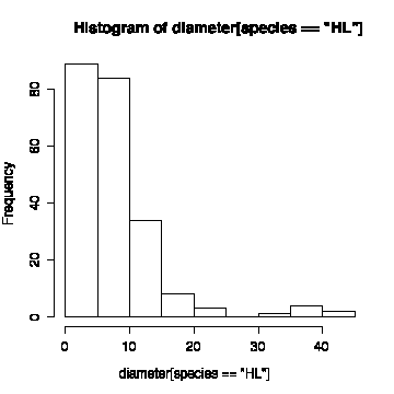
The histogram of diameter (all species) is non-normal. The histograms by species are easier to interpret than the histograms with all species together. None of the distributions are symmetric; most are positively skewed. The exception are Douglas fir which is more or less symmetric (diameter, height to first branch) or negatively skewed (height). [You might note that foresters like to use Weibull distributions (Montgomery & Runger, p. 193) for tree diameter or height, as Weibull distributions can be positively or negatively skewed.]
> hist(diameter)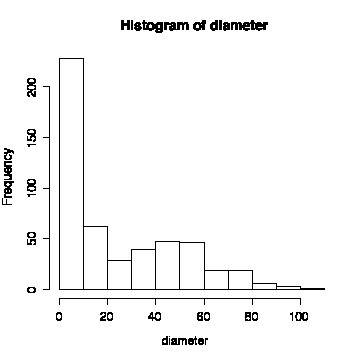
> hist(diameter[species=="DF"])
> hist(diameter[species=="HL"])
Here are the histograms for height (all trees, then by species) and height to first branch (all trees, then by species).
> hist(height)> hist(height[species=="CD"])
> hist(height[species=="DF"])
> hist(height[species=="HL"])
> hist(htfb)
> hist(htfb[species=="CD"])
> hist(htfb[species=="DF"])
> hist(htfb[species=="HL"])

[You might be interested to see the Case Study on Old-Growth Forest from which these data are taken. All 2050 trees in the plot are included there. For this question I removed the dead trees and the saplings, leaving 958 trees, then I randomly selected 500 of those to make the data set smaller and easier to work with.]
Q2
I begin by loading the time series library so that I can use lag.plot(), and attaching the data frame series so that I can reference the columns by name without having to give the name of the data frame each time.
> library(ts)
> attach(series)
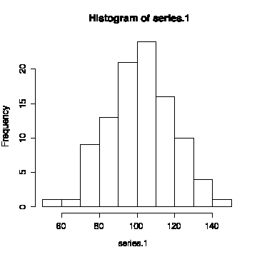
The first series has a mean of 101.59 and a standard deviation of 17.09. The sequence plot seems to oscillate randomly about the mean and the lag plot shows no autocorrelation so the series appears to be random and independent with constant mean.
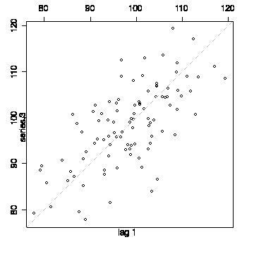
I have drawn the lag plot with a lag of +1. A lag of -1 would give the transpose of this graph but lead to the same interpretation.
The histogram looks reasonably normal, suggesting that this is a series of independent normal observations.
> mean(series.1) [1] 101.5885 > sqrt(var(series.1)) [1] 17.08850 > plot(series.1,type="l") > abline(h=mean(series.1))> lag.plot(series.1, do.lines=F)
> hist(series.1)
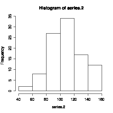
If we put line through the mean of the second series, most of the first 60 points lie below the line, while most of the remaining 40 points lie above the line. This indicates that the mean of the process jumps from 99.68 to 120.38 at about the 60th observation. Putting dotted lines through the two means (indices 1 to 60 and 61 to 100) confirms this model.
The shift in mean makes the lag plot harder to interpret, but it does not show any strong autocorrelation.
The histogram is slightly positively skewed, but that could be the result of the shift in mean and it is possible that this is a series of independent normal observations with a shift in mean.
> mean(series.2) [1] 107.9632 > sqrt(var(series.2)) [1] 22.7604 > mean(series.2[1:60]) [1] 99.6835 > sqrt(var(series.2[1:60])) [1] 18.66564 > mean(series.2[61:100]) [1] 120.3827 > sqrt(var(series.2[61:100])) [1] 22.89696 > plot(series.2,type="l") > abline(h=mean(series.2)) > lines(c(1,60),rep(mean(series.2[1:60]),2),lty=2) > lines(c(61,100),rep(mean(series.2[61:100]),2),lty=2)> lag.plot(series.2,do.lines=F)
> hist(series.2)
The third series has a mean of 98.34 and a standard deviation of 8.62, so it is less variable. The sequence plot does not oscillate as rapidly as that of the other two series and the lag plot lies more on the diagonal, giving evidence of autocorrelation in the series.
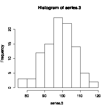
The histogram looks reasonably normal, indicating that this is a sequence of correlated normal observations.
> mean(series.3) [1] 98.3388 > sqrt(var(series.3)) [1] 8.624218 > plot(series.3,type="l") > abline(h=mean(series.3))> lag.plot(series.3,do.lines=F)