A sequence of observations made at successive times is called a time series. A time series may exhibit trend (a steady increase or decrease in the mean level), periodicity (e.g. daily, weekly or seasonal fluctuations driven by external factors), and autocorrelation (the observations are not statistically independent, but observations close together in the sequence are more likely to be similar than observations further apart in the sequence).
Time series are important in many area, including Economics and Process Control. There are advanced statistical methods for removing trend and periodicity and modelling the autocorrelation structure.
In Statistics 3N3, all of the statistical techniques we will study assume that you have independent observations. If the observations were made at successive times, autocorrelation is the most likely alternative. The Time Series Plot and the Lag-1 Plot are the simplest graphical ways to test that assumption.
Here is a simple artificial example. Assuming that trend and periodicity are not an issue, we are only looking for autocorrelation. Of course, in practice, you would want more than 11 observations if you were testing for autocorrelation.
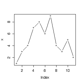
First, use c() to put the data, assumed to be in time order, into an array and use length() to check the number of observations. The first call to plot() plots the values of x against "Index", that is, the order in the array. The argument "type="b" means that the points and their connecting lines are both shown.
> x <- c(1,3,4,7,8,6,9,4,3,5,2)
> length(x)
[1] 11
> plot(x,type="b")
To make a lag-1 plot we need to plot x[1] on the ordinate against x[2] on the abscissa, x[2] on the ordinate against x[3] on the abscissa, and so on, up to x[10] on the ordinate against x[11] on the abscissa. This is done by plotting the array x[-11] (that is, the x array with the last observation removed) on the ordinate, against the array x[-1] (that is, the x array with the first observation removed) on the abscissa. The call to abline() adds a line with 0 intercept and unit slope, while lty=2 makes it a dashed line.
> plot(x[-1],x[-11],type="b")
> abline(0,1,lty=2)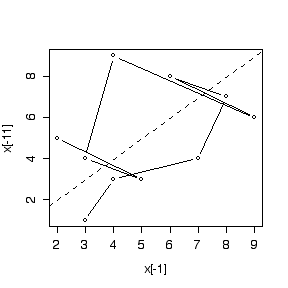
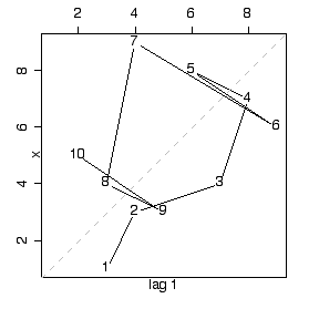
If we attach the time series library, we can also use a built-in function lag.plot() for making lag plots. Note that lag.plot() has several enhancements over the home-made lag plot: better axis labels, a square plot area, a grey dashed line for the diagonal, and the serial order of the points shown explicitly on the graph. These could, of course, be done by adding various options to the plot() call but it is easier to use the lag.plot() function. Note that the library will remain attached until the end of the session, or until detached.
> library(ts)
> lag.plot(x)