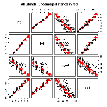
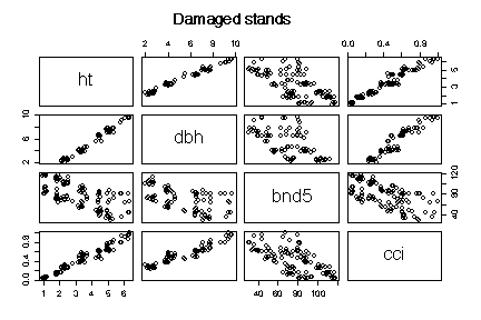
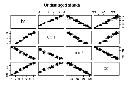
The graphs show that there is a strong linear relationship between mean height and mean diameter. Because height and diameter were determined for individual trees, it is not surprising that this relationship is the same for the damaged and undamaged stands.
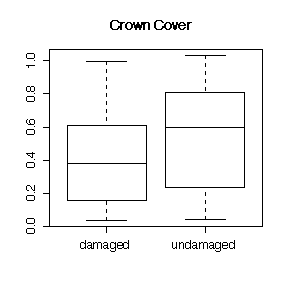
The relationships between crown cover index and height and between crown cover index and diameter are not quite as tight, but they too are the same for damaged and undamaged stands.
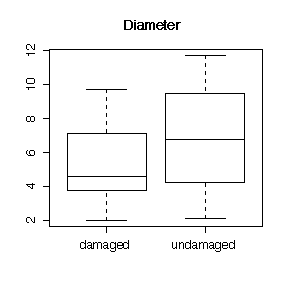
The height-diameter relationship shows a series of clusters, suggesting that stands of different ages are distinct. The oldest stands (the largest trees) were all undamaged.
The satellite "Band 5" reading appears to give a reasonably accurate prediction of mean height, mean diameter and crown cover of a stand, but only for undamaged stands. The relationship is much more dispersed for the damaged stands. Note that if you know the age of a stand, "Band 5" does not add any useful information (look at one cluster at a time; there is no clear relationship).
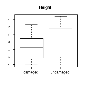
The comparative box plots (or comparative histograms) show that the median and upper quartile of height, diameter and crown cover are greater in the undamaged stands than in the damaged stands, but this might be explained by the fact that the oldest stands happened to be undamaged.
Scatterplots (damaged and undamaged separated somehow) and conclusions: 12 marks
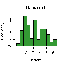
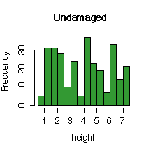
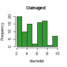
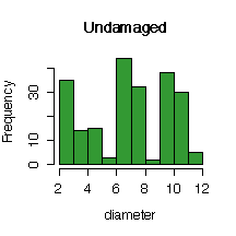
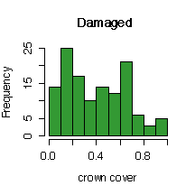
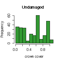
Comparative box plots (or comparative histograms) and conclusions: 8 marks
The conclusions do not have to be a detailed as the ones above, but they need to be substantiated by the data. You are not expected to comment on the distinct ages.
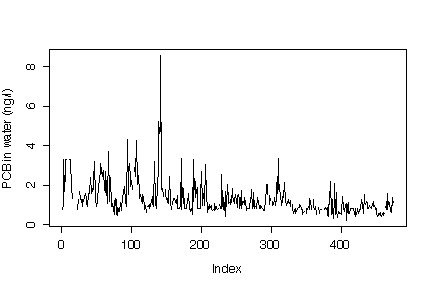
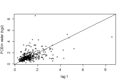
In the time series plot in original units, the most striking observation is that the upper extremes are much lower in the second decade, and the series becomes less variable, There is an annual cycle (52 weekly points = 1 year) but it is hard to see or describe because the dates are not given. The lag 1 plot is difficult to interpret because of the small number of extreme points.
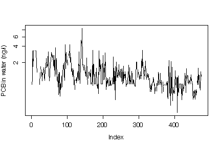
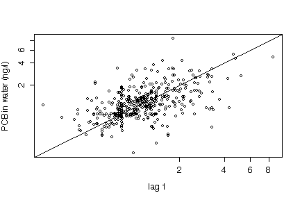
The time series plot in log units shows a general decline in mean level in the second decade and a variance relatively constant over both decades. The annual cycle is as clear as it was in the original units. The lag 1 plot is easier to interpret in log units and gives some indication of autocorrelation. The log units reduce the visual impact of the higest values and this may not be a good thing as high levels are of the greatest concern.
Graphs: 10 marks
Discussions: 10 marks
The discussion must include all the points mentioned above.