I have put the R code before each graph to make it easier to see exactly how I created it. If you were writing a formal report, the R code would be omitted or put in an Appendix, so you are not required to show it for this assignment. Marks are indicated in red, including 10 marks for the quality of your presentation.
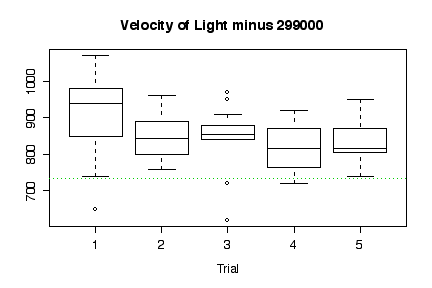
The box plots show that Trial 1 readings are substantially higher than Trials 2 to 5, and somewhat more variable. This suggests a "startup" effect. The "true" value of 734.5 is indicated by the green dotted line; almost all of the readings are above this line, indicating that there was a positive bias in the measuring instrument.
> michelson$trial <- factor(rep(1:5, rep(20, 5)))
> boxplot(velocity~trial, michelson, main = "Velocity of Light minus 299000", xlab="Trial")
> abline(h=734.5, lty=3, col=3)
The stem and leaf plot indicates a reasonably symmetric distribution of concentration, centered around 17.2.
The time series plot is too short to show a trend with any certainty, but the concentration does appear to rise over the first 50 hours. There is no suggestion of an abrupt shift in the mean.
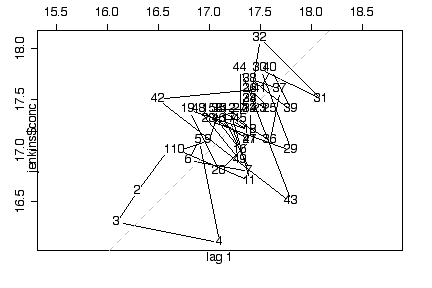
The lag plot at first sight indicates autocorrelation, as it lies along the diagonal, but on closer inspection this is mostly due to the first 4 observations of the series; if you ignore the first 4 points, the plot looks less diagonal and more random. Hence we conclude that there is at most weak autocorrelation.
> jenkins$conc
 [1] 17.0 16.6 16.3 16.1 17.1 16.9 16.8 17.4 17.1 17.0 16.7 17.4 17.2 17.4
[15] 17.4 17.0 17.3 17.2 17.4 16.8 17.1 17.4 17.4 17.5 17.4 17.6 17.4 17.3
[29] 17.0 17.8 17.5 18.1 17.5 17.4 17.4 17.1 17.6 17.7 17.4 17.8 17.6 17.5
[43] 16.5 17.8 17.3 17.3 17.1 17.4 16.9 17.3
> stem(jenkins$conc)

  The decimal point is 1 digit(s) to the left of the |

  160 | 0
  162 | 0
  164 | 0
  166 | 00
  168 | 0000
  170 | 000000000
  172 | 0000000
  174 | 00000000000000000
  176 | 0000
  178 | 000
  180 | 0

> plot(2*(0:49), jenkins$conc, xlab="time (hr)", ylab="concentration",
 main="Box, Jenkins & Reinsel Data", type="l")
> lag.plot(jenkins$conc)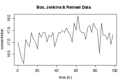
We conclude that, for each tool type, lathe speed affects surface finish linearly, over the range of lathe speeds investigated. The slope of the relationship is the same for each tool type, but the finish is about 5 units higher with tool type 302 than tool type 416 at any given lathe speed.
There is no suggestion that the observations are presented in temporal order, so time series plots and lag plots would be inappropriate for these data.
> plot(finish~rpm,surface,pch=as.numeric(surface$tool),col=as.numeric(surface$tool))
> abline(lm(finish~rpm,surface[surface$tool==302,]),col=1)
> abline(lm(finish~rpm,surface[surface$tool==416,]),col=2)
> coef(lm(finish~rpm,surface[surface$tool==302,]))
(Intercept)         rpm
 11.5029384   0.1529260
> coef(lm(finish~rpm,surface[surface$tool==416,]))
(Intercept)         rpm
  5.4087118   0.1223564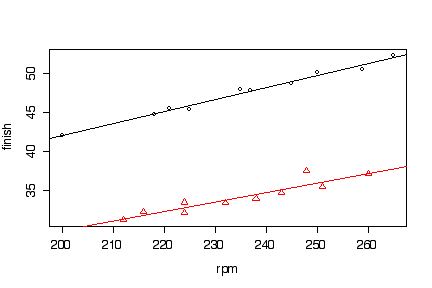
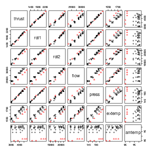
All of the variables except ambient temperature show strong linear relationships with thrust, over the range of values investigated. A lower ambient temperature gives greater thrust at any given level of secondary speed of rotation, flow, or exhaust temperature but does not affect the response of thrust to changes in primary speed of rotation or pressure. Since primary speed of rotation is highly correlated with secondary speed of rotation and with pressure, we may not need all three of those variables in a model to predict thrust.
> pairs(jet, pch=1+(jet$amtemp<90), col=1+(jet$amtemp<90))
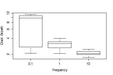
The box plots of crack growth against frequency, ignoring differences in environment, show a higher median and much greater variation for low loading frequency (0.1) than for medium (1) and high (10) frequencies. Medium loading frequency gives slightly greater crack growth than high loading frequency.
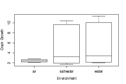
The box plots of crack growth against environment, ignoring differences in loading frequency, show a higher median and much greater variation for water and saltwater environments than for air; however, water and saltwater are almost identical in effect.
Since the box plots are based on medians, quartiles and extremes, it makes no difference (other than to the y-axis tic marks) whether the data are transformed or the y axis is transformed. In this example, transforming to a log scale does not change the graphs very much.
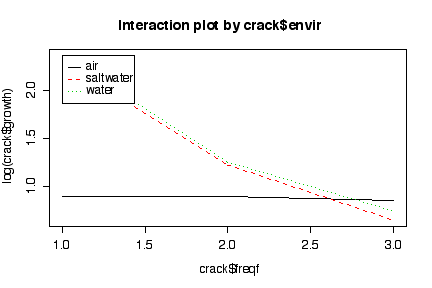
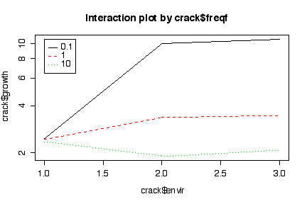
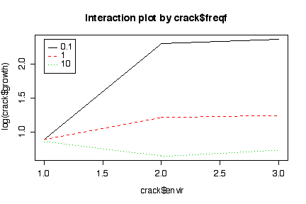
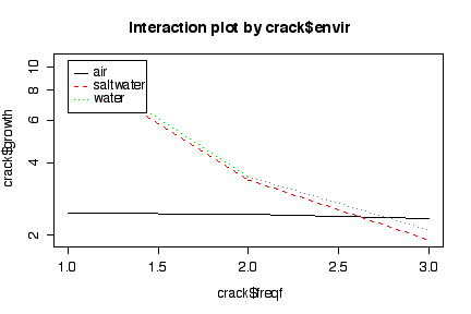
The interaction plots show that crack growth is minimal in an air environment at any of the loading frequencies tried. Crack growth is about the same in a saltwater or water environment, in either case being much higher at at low loading frequency than at medium loading frequency. At high loading frequency, crack growth is about the same in all three environments.
Since the log of a mean is not the same as the mean of the logs, we know that it will make a difference in the interaction plots whether we log-transform the data or plot the means on a log scale, but the difference is too small to notice on the graphs, so it does not matter which way we do it. The log scale exaggerates the differences between different conditions when the crack growth rate is low.
> crack growth freq freqf envir 1 2.29 10.0 10 air 2 2.47 10.0 10 air 3 2.48 10.0 10 air 4 2.12 10.0 10 air 5 2.06 10.0 10 water 6 2.05 10.0 10 water 7 2.23 10.0 10 water 8 2.03 10.0 10 water 9 1.90 10.0 10 saltwater 10 1.93 10.0 10 saltwater 11 1.75 10.0 10 saltwater 12 2.06 10.0 10 saltwater 13 2.65 1.0 1 air 14 2.68 1.0 1 air 15 2.06 1.0 1 air 16 2.38 1.0 1 air 17 3.20 1.0 1 water 18 3.18 1.0 1 water 19 3.96 1.0 1 water 20 3.64 1.0 1 water 21 3.10 1.0 1 saltwater 22 3.24 1.0 1 saltwater 23 3.98 1.0 1 saltwater 24 3.24 1.0 1 saltwater 25 2.24 0.1 0.1 air 26 2.71 0.1 0.1 air 27 2.81 0.1 0.1 air 28 2.08 0.1 0.1 air 29 11.00 0.1 0.1 water 30 11.00 0.1 0.1 water 31 9.06 0.1 0.1 water 32 11.30 0.1 0.1 water 33 9.96 0.1 0.1 saltwater 34 10.01 0.1 0.1 saltwater 35 9.36 0.1 0.1 saltwater 36 10.40 0.1 0.1 saltwater > boxplot(growth~freqf, crack, xlab="Frequency", ylab="Crack Growth") > boxplot(growth~freqf, crack, xlab="Frequency", ylab="Crack Growth",log="y") > boxplot(growth~envir, crack, xlab="Environment", ylab="Crack Growth") > boxplot(growth~envir, crack, xlab="Environment", ylab="Crack Growth", log="y")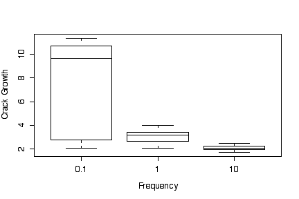
> interactplot <- function (y, facta, factb, xlab = deparse(substitute(factb)), ylab = deparse(substitute(y)), main = paste("Interaction plot by", deparse(substitute(facta))), ...) { values <- sapply(split(y, facta:factb), mean) matplot(matrix(values, ncol = nlevels(facta)), type = "l", xlab = xlab, ylab = ylab, ...) title(main = main) legend(1, max(values), levels(facta), lty = 1:nlevels(facta), col = 1:nlevels(facta)) invisible() } > interactplot(crack$growth, crack$freqf, crack$envir) > interactplot(crack$growth, crack$freqf, crack$envir, log="y") > interactplot(log(crack$growth), crack$freqf, crack$envir) > interactplot(crack$growth, crack$envir, crack$freqf) > interactplot(crack$growth, crack$envir, crack$freqf, log="y") > interactplot(log(crack$growth), crack$envir, crack$freqf)

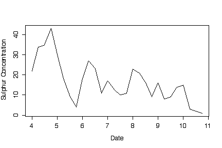
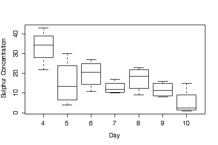
The box plot of sulphur concentration against date shows a fairly steady decrease over time; the boxplot against time of day shows that it is highest at midnight and declines until 6:00 pm. The time series plot shows an overall downward trend, despite a rise at midnight each night. It would be interesting to continue the time series over more days, to see of the pollution level continues to fall, or shows seasonal fluctuations, or rises and falls at seemingly random times in the year.
The decline in sulphur concentration during each day indicates that sampling must be done either at the same time each day or at consistent times over each day; if time of day were chosen haphazardly or for convenience, variation within days would exaggerate the observed variation between days.
What other considerations can you think of?
> sulphur
   conc day time  date
1    22   4    0  4.00
2    34   4    6  4.25
3    35   4   12  4.50
4    43   4   18  4.75
5    30   5    0  5.00
6    18   5    6  5.25
7     9   5   12  5.50
8     4   5   18  5.75
9    18   6    0  6.00
10   27   6    6  6.25
11   23   6   12  6.50
12   11   6   18  6.75
13   17   7    0  7.00
14   13   7    6  7.25
15   10   7   12  7.50
16   11   7   18  7.75
17   23   8    0  8.00
18   21   8    6  8.25
19   16   8   12  8.50
20    9   8   18  8.75
21   16   9    0  9.00
22    8   9    6  9.25
23    9   9   12  9.50
24   14   9   18  9.75
25   15  10    0 10.00
26    3  10    6 10.25
27    2  10   12 10.50
28    1  10   18 10.75
> boxplot(conc~time, sulphur, xlab="Time of Day", ylab="Sulphur Concentration")
> boxplot(conc~day, sulphur, xlab="Day", ylab="Sulphur Concentration")
> plot(conc~date, sulphur, xlab="Date", ylab="Sulphur Concentration", type="l")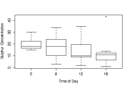
Give a maximum of 10 marks for a good presentation: clearly worded, neatly laid out on the page, easy to read and understand, free of errors in spelling or grammar.