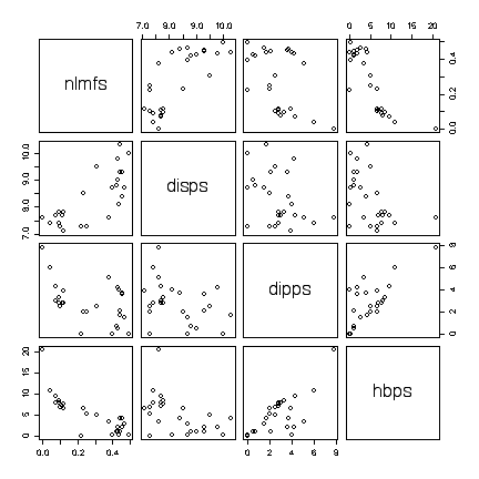
I have labelled the variables nlmfs = "negative log of mole fraction solubility", disps = "dispersion partial solubility parameter", dipps = "dipolar partial solubility parameter", hbps = "hydrogen bonding partial solubility parameter".
The "negative log" isn't an issue, the experimenters can express mole fraction solubility on any scale they like, but there is an advantage to choosing one that gives linear relations with the solubility parameters of interest.
There is no suggestion that the data are in any order, so time sequence plots, lag plots, etc. would be inappropriate.
The scatterplots show a positive nonlinear relation between nlmfs and disps and a negative linear relation between nlmfs and hbps.
The relationships of dipps with nlmfs, disps or hbps are very weak, as the points on the scatterplot show a random scatter. There is a curious boundary in the scatterplot of dipps versus hbps and it would be interesting to see if this is an artifact of how the parameters are measured or computed.
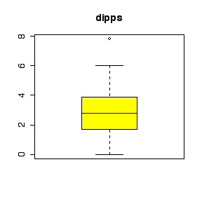
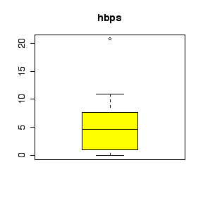
The scatterplots show an outlier: one point has both the largest hbps value and the largest dipps value and is well away from the others in several of the plots. Repeating the scatterplot matrix with this point removed strengthens the conclusions above. It would be interesting to find out from the experimenters if there were any special circumstances that might justify deleting this point from the data.
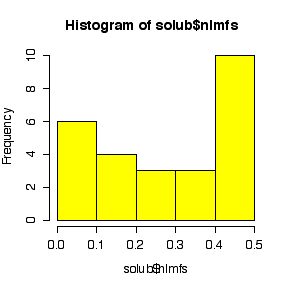
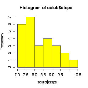
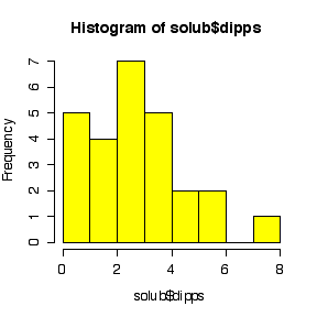
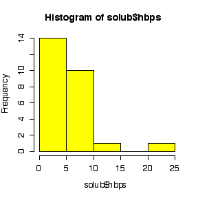
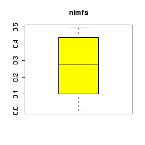
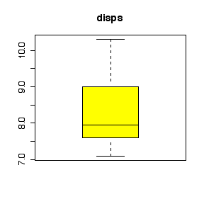
The comparative histograms show negative skewness (long left tail) for nlmfs (not surprising in view of the negative log transformation, which will reverse skewness) and positive skewness (long right tail) for the three parameters.
|
|
|
|
|
|
|
|
|
|
|
|
Scatterplots and
conclusions: 7 marks
Comparative box plots (or
comparative histograms) and conclusions: 7 marks
Discussion of the outlier:
2
marks
Quality of presentation
(appearance, clarity, writing): 4 marks
Inappropriate plots:
up to 4 marks
off
The
conclusions do not have to be as detailed as the ones above, but they
need to be substantiated by the data.
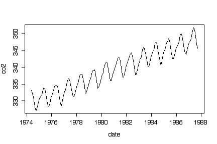
The time series plot shows a remarkably steady linear upward trend over the entire study period, with a very regular seasonal variation superimposed.
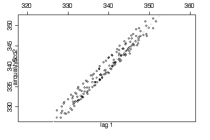
The lag 1 plot follows the diagonal closely but this is obviously an artifact of the trend and seasonal variation and does not in itself indicate autocorrelation. [Bonus mark if you noticed this, as I mentioned it but didn't discuss it in class.]
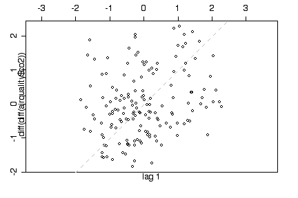
A lag 1 plot of the second differences of the time series shows a random scatter and indicates that when trend and seasonality are removed, there is no evidence of autocorrelation. [OK, I'm not expecting you to have thought of this yourself on the test but I thought you would like to know about it. How does differencing remove trend and seasonality?]
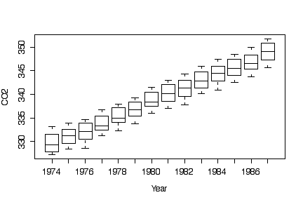
Box plots by year show the linear trend without the seasonal variation.
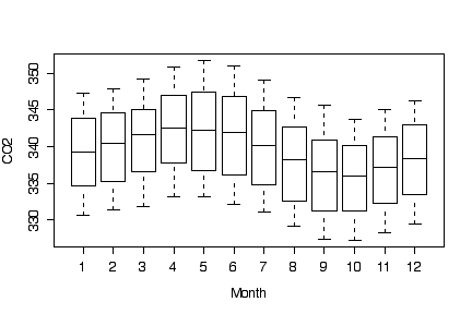
Box plots by month show the seasonal variation without the trend, with CO2 levels being highest in the spring and lowest in the autumn. The trend inflates the variance of each box.
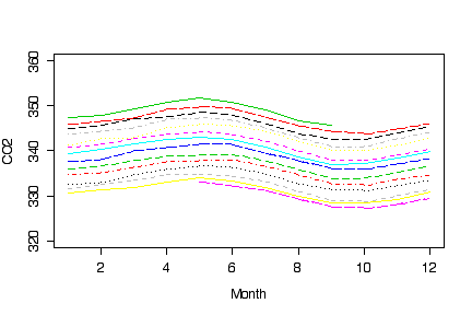
I noticed some students succeeded in drawing graphs that compared the seasonal variation from year to year; here is how I would do it. I didn't put on a legend because the successive years from 1974 to 1987 clearly lie one above the other.
The main question one is left with is what is causing the linear trend, in particular whether it is a natural phenomenon or the result of human activity. The seasonal variation is most likely natural although it could be related to seasonal differences in human activity. These questions can be raised by data such as these but can't be answered without more data on other possible factors affecting CO2 levels at this particular location.
> plot(co2~date, airquality, type="l")
> library(ts)
> lag.plot(airquality$co2)
> lag.plot(diff(diff(airquality$co2)))
> boxplot(co2~year, airquality, xlab="Year", ylab = "CO2")
> boxplot(co2~month, airquality, xlab="Month", ylab = "CO2")
> plot(c(1,12),c(320,360),type="n", xlab="Month", ylab= "CO2")
> for (i in 1974:1987) lines(co2~month, airquality[airquality$year==i,], lty=i, col=i)
At least
the time series plot, lag plot, box plots by year, and box plots by
month: 8 marks
Discussions: 8 marks
Bonus: up to 4 marks
Quality of presentation
(appearance, clarity, writing): 4 marks
Inappropriate
plots: up to 4 marks
off