[Overall quality of presentation: up to 10 marks for a concisely worded report, nicely laid out, free of grammatical and typographical errors.]
[Boxplots 4; interaction plots 4; log scales 4; discussion 6]
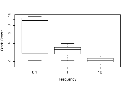
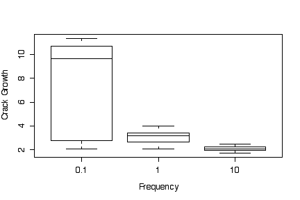
The box plots of crack growth against frequency, ignoring differences in environment, show a higher median and much greater variation for low loading frequency (0.1) than for medium (1) and high (10) frequencies. Medium loading frequency gives slightly greater crack growth than high loading frequency.
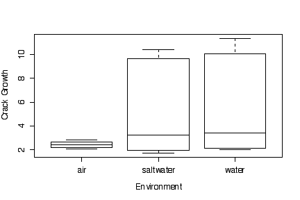
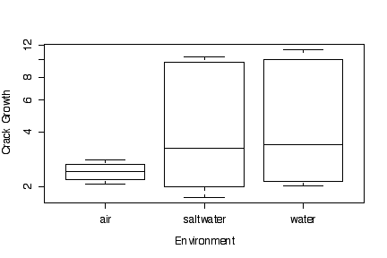
The box plots of crack growth against environment, ignoring differences in loading frequency, show a higher median and much greater variation for water and saltwater environments than for air; however, water and saltwater are almost identical in effect.
Since the box plots are based on medians, quartiles and extremes, it makes no difference (other than to the y-axis tic marks) whether the data are transformed or the y axis is transformed. In this example, transforming to a log scale does not change the graphs very much.
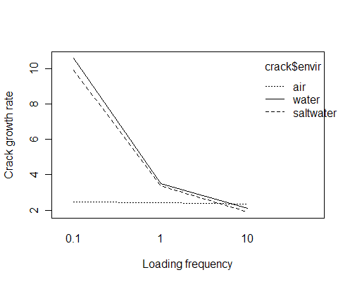
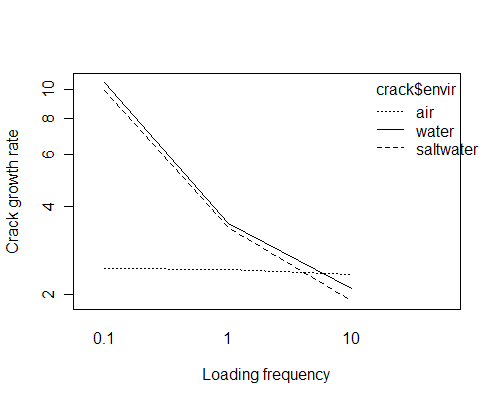
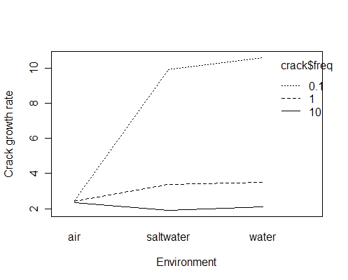
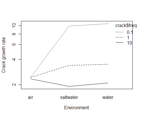
The interaction plots show that crack growth is minimal in an air environment at any of the loading frequencies tried. Crack growth is about the same in a saltwater or water environment, in either case being much higher at at low loading frequency than at medium loading frequency. At high loading frequency, crack growth is about the same in all three environments.
Since the log of a mean is not the same as the mean of the logs, we know that it will make a difference in the interaction plots whether we log-transform the data or plot the means on a log scale, but the difference is too small to notice on the graphs, so it does not matter which way we do it. The log scale exaggerates the differences between different conditions when the crack growth rate is low.
> crack
   growth freq freqf     envir
1    2.29 10.0    10       air
2    2.47 10.0    10       air
3    2.48 10.0    10       air
4    2.12 10.0    10       air
5    2.06 10.0    10     water
6    2.05 10.0    10     water
7    2.23 10.0    10     water
8    2.03 10.0    10     water
9    1.90 10.0    10 saltwater
10   1.93 10.0    10 saltwater
11   1.75 10.0    10 saltwater
12   2.06 10.0    10 saltwater
13   2.65  1.0     1       air
14   2.68  1.0     1       air
15   2.06  1.0     1       air
16   2.38  1.0     1       air
17   3.20  1.0     1     water
18   3.18  1.0     1     water
19   3.96  1.0     1     water
20   3.64  1.0     1     water
21   3.10  1.0     1 saltwater
22   3.24  1.0     1 saltwater
23   3.98  1.0     1 saltwater
24   3.24  1.0     1 saltwater
25   2.24  0.1   0.1       air
26   2.71  0.1   0.1       air
27   2.81  0.1   0.1       air
28   2.08  0.1   0.1       air
29  11.00  0.1   0.1     water
30  11.00  0.1   0.1     water
31   9.06  0.1   0.1     water
32  11.30  0.1   0.1     water
33   9.96  0.1   0.1 saltwater
34  10.01  0.1   0.1 saltwater
35   9.36  0.1   0.1 saltwater
36  10.40  0.1   0.1 saltwater

> boxplot(growth~freqf, crack, xlab="Frequency", ylab="Crack Growth")
> boxplot(growth~freqf, crack, xlab="Frequency", ylab="Crack Growth",log="y")
> boxplot(growth~envir, crack, xlab="Environment", ylab="Crack Growth")
> boxplot(growth~envir, crack, xlab="Environment", ylab="Crack Growth", log="y")
> interaction.plot(crack$freq, crack$envir, crack$growth, xlab="Loading frequency", ylab="Crack growth rate")
> interaction.plot(crack$freq, crack$envir, crack$growth, xlab="Loading frequency", ylab="Crack growth rate", log="y")
> interaction.plot(crack$envir, crack$freq, crack$growth, xlab="Environment", ylab="Crack growth rate")
> interaction.plot(crack$envir, crack$freq, crack$growth, xlab="Environment", ylab="Crack growth rate",log="y")
[Up to 18 marks for an analysis with at least 4 graphs and appropriate comments about 4 or more variables.]
Note: I have used variable names to keep this short, but your "plain language" report should write out the descriptive phrase every time, so "rut" would be "maximal depth of ruts", etc.
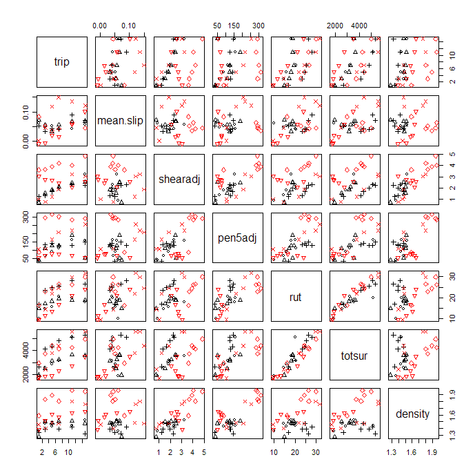
The scatterplot matrix shows a strong linear correlation between rut and totsur, so, for a first look at the data, either measure of damage should be suitable. We may not have to study both. The examples here look mostly at rut. The scatterplots show trail coded by plotting character and soil type coded by colour (black = 1 = sand, red = 2 = clay).
Some bivariate plots, shearadj versus trip, for example, show the different trails as very clear lines, some with positive slope, some negative, and this is unrelated to whether the soil is sand or clay. We have no other information distinguishing the trails so the unexplained between-trail differences will make the data more difficult to interpret.
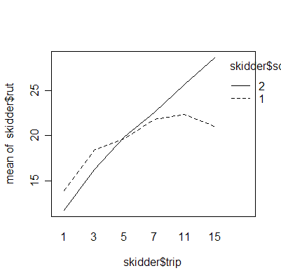
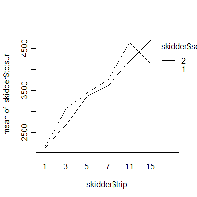
The interaction plots show that the deepest rutting takes place on the first trip; subsequent trips have less effect. Clay soil is more prone to rutting than sand soil.
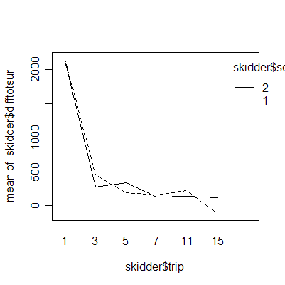
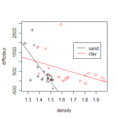
The plot of difftotsur (difference between the surfaces of displaced materials adjusted by the number of trips) versus soil density shows an important difference between sand and clay but between-trip consistency within sand and within clay.
> pairs(skidder[,3:9], col=skidder$soil, pch=skidder$trail)
> interaction.plot(skidder$trip, skidder$soil, skidder$rut)
> interaction.plot(skidder$trip, skidder$soil, skidder$diffdepth)
> interaction.plot(skidder$trip, skidder$soil, skidder$difftotsur)
> plot(difftotsur~density, skidder, col=skidder$soil, pch=skidder$trail)
> abline(lm(difftotsur~density, skidder[skidder$soil==1,]))
> abline(lm(difftotsur~density, skidder[skidder$soil==2,]), col=2)
> legend(1.7, 2000, c("sand","clay"),lty=1, col=1:2)

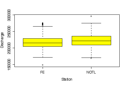
The discharges at Fort Erie and at Niagara on the Lake are equally variable and follow similar distributions, but the median discharge is higher at Niagara on the Lake. This is to be expected, as Niagara on the Lake is downstream from Fort Erie. [5 marks]
> boxplot(DISCHARGE~STATION, data=niagara, col="yellow", xlab="Station", ylab="Discharge")
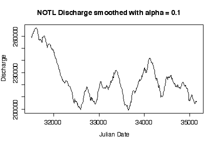
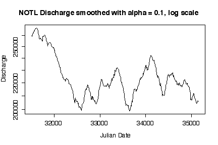
It is interesting that discharge was highest in the first two years, then dropped to a median level around 220000 cfs with more or less annual fluctuations. Log transformations only make a difference when the range of the variable extends over orders of magnitude; here, the maximum smoothed discharge is about 1.7 times the minimum, which is well within an order of magnitude. [5 marks]
> esmooth <- function (series, alpha = 0.1)
{
    esseries <- series
    for (t in 2:length(series)) esseries[t] <- ifelse(is.na(series[t]),
        esseries[t - 1], alpha * series[t] + (1 - alpha) * esseries[t - 1])
    esseries
}
> plot(esmooth(DISCHARGE)~JULIAN.DATE, niagara[niagara$STATION=="NOTL", ], type="l", xlab="Julian Date",
ylab="Discharge", main="NOTL Discharge smoothed with alpha = 0.1")
> plot(esmooth(DISCHARGE)~JULIAN.DATE, niagara[niagara$STATION=="NOTL", ], type="l", xlab="Julian Date",
ylab="Discharge", main="NOTL Discharge smoothed with alpha = 0.1, log scale", log="y")
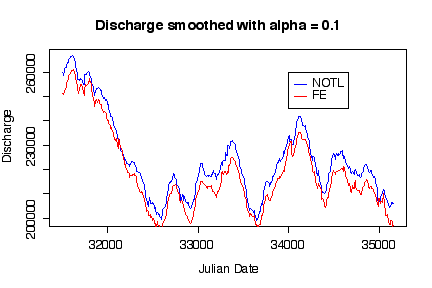
Not only do the time series plots show trend and seasonality, putting both time series on the same graph shows that discharge at Niagara on the Lake was consistently higher than at Fort Erie. [5 marks]
> plot(esmooth(DISCHARGE)~JULIAN.DATE, niagara[niagara$STATION=="NOTL", ], type="l", xlab="Julian Date",
ylab="Discharge", main="Discharge smoothed with alpha = 0.1", col="blue")
> lines(esmooth(DISCHARGE)~JULIAN.DATE, niagara[niagara$STATION=="FE", ],  col="red")
> legend(34000,260000,c("NOTL","FE"), lty=1, col=c("blue","red"))
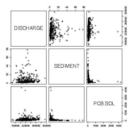
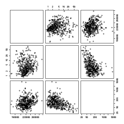
The extreme values dominate the plots in original units, obscuring any relationships. There is a bug in the pairs() function that prevents the variable names showing when the option for logarithmic axes is used, but we can see that there is a weak negative linear correlation between Sediment and the concentration of PCB in Solids, and no correlation between either of these variables and discharge. [8 marks]
> pairs(niagara[niagara$STATION=="NOTL", c(4,5,12)])
> pairs(niagara[niagara$STATION=="NOTL", c(4,5,12)], log="xy")
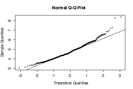
The normal probability plot shows that the distribution of the log of PCB concentration in solids is not normal. (The sample quantiles in the left tail are higher than would be expected under normality, the sample quantiles in the right tail are also higher than expected, indicating positive skewness.) A histogram could also be used to reach the same conclusion. [3 marks for either qqnorm() or the histogram, plus 3 marks for qqline() or the superimposed normal density.]
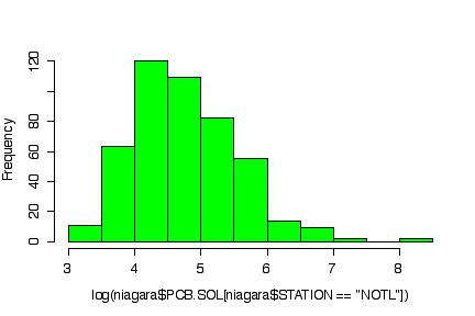
> qqnorm(log(niagara$PCB.SOL[niagara$STATION=="NOTL"]))
> qqline(log(niagara$PCB.SOL[niagara$STATION=="NOTL"]))
> hist(log(niagara$PCB.SOL[niagara$STATION=="NOTL"]), col="green")
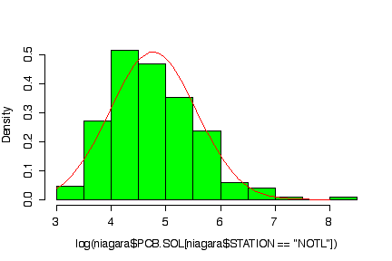
> logpcbsoln <- log(niagara$PCB.SOL[niagara$STATION=="NOTL"])
> hist(log(niagara$PCB.SOL[niagara$STATION=="NOTL"]), prob=T, col="green")
> xgr <- seq(3,8,length=101)
> lines(xgr, dnorm(xgr, mean(logpcbsoln,na.rm=T), sqrt(var(logpcbsoln,na.rm=T))), col="red")