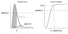
R knows about lots of probability distributions. For each, it can generate random numbers drawn from the distribution (“deviates”); compute the cumulative distribution function and the probability distribution function; and compute the quantile function, which gives the x value such that ∫ 0xP(x)dx (area under the curve from 0 to x) is a specified value, such as 0.95 (think about “tail areas” from standard statistics). For example, you can obtain the critical values of the standard normal distribution, ±1.96, with qnorm(c(0.025,0.975)).
Let’s take the binomial distribution (yet again) as an example.
First, use set.seed() for consistency:
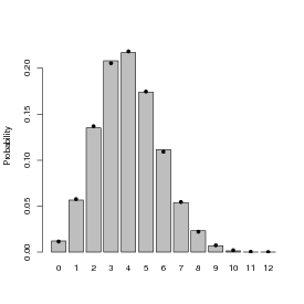
Now plot the result of drawing 200 values from a binomial distribution with N = 12 and p = 0.1 and plotting the results as a factor (with 200 draws we don’t have to worry about any of the 13 possible outcomes getting missed and excluded from the plot):
(Saying plot(factor(z,...)) gives a nice barplot. What do you get if you just say plot(z)?)
These four functions exist for each of the distributions R has built in: e.g. for the normal distribution they’re rnorm(), pnorm(), dnorm(), qnorm(). Each distribution has its own set of parameters (so e.g. pnorm(x) is pnorm(x,mean=0,sd=1)).
You can use the R functions to test your understanding of a distribution and make sure that random draws match up with the theoretical distributions as they should. This procedure is particularly valuable when you’re developing new probability distributions by combining simpler ones, e.g. by zero-inflating or compounding distributions.
The results of a large number of random draws should have approximately the correct moments (mean and variance), and a histogram of those random draws (with freq=FALSE or prob=TRUE) should match up with the theoretical distribution. For example, draws from a binomial distribution with p = 0.2 and N = 20 should have a mean of approximately Np = 4 and a variance of Np(1 - p) = 3.2:
The mean is very close, the variance is a little bit farther off. We can use the replicate() function to re-do this command many times and see how close we get:
(this may take a little while; if it takes too long, lower the number of replicates to 100).
Looking at the summary statistics and at the 2.5% and 97.5% quantiles of the distribution of variances:
(Try plotting a histogram (hist(var_dist)) or a kernel density estimate (plot(density(var_dist))) of these replicates.) Even though there’s some variation (of the variance) around the theoretical value, we seem to be doing the right thing since the theoretical value (Np(1 - p)) falls within the central 95% of the empirical distribution.
Finally, we can compare the observed and theoretical quantiles of our original sample:
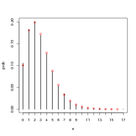
Figure 2 shows the entire simulated frequency distribution along with the theoretical values. The steps in R are:
(The levels command is necessary in this case because the probability of x = 12 with p = 0.2 and N = 12 is actually so low (≈ 4 × 10⁻⁹) that it’s likely that a sample of 10,000 won’t include any samples with 12 successes.)
(barplot() doesn’t put the bars at x locations corresponding to their numerical values, so you have to save those values as b1 and re-use them to make sure the theoretical values end up in the right place.)
Here are a few alternative ways to do this plot: try at least one for yourself.
(plots the number of observations without rescaling and scales the probability distribution to match);
Plotting a table does a plot with type="h" (high density), which plots a vertical line for each value. I think it’s not quite as pretty as the barplot, but it works. (Don’t forget to use 0:12 for the x axis values — if you don’t specify x the points will end up plotted at x locations 1:13.) Unlike factors, tables can be scaled numerically, and the lines end up at the right numerical locations, so we can just use 0:12 as the x locations for the theoretical values.
Doing the equivalent plot for continuous distributions is actually somewhat easier, since you don’t have to deal with the complications of a discrete distribution: just use hist(...,prob=TRUE) to show the sampled distribution (possibly with ylim adjusted for the maximum of the theoretical density distribution) and ddist(x,[parameters],add=TRUE) to add the theoretical curve.
Let’s go through the same exercise for the lognormal, a continuous distribution:
Plot the results:
Add a parametric estimate of the curve, based on the observed mean and standard deviation of the log-values:
Note that the maximum height of the parametric curve is higher than the maximum height of the density estimator: this is generally true, since the density estimator “smooths” (smears out) the data.
The probability of x > 20, and the 95% confidence limits:
Comparing the theoretical values of the mean and variance with the observed values for this random sample (see ?rlnorm for theoretical values):
There is a fairly large difference between the expected and observed variance. This is typical: variances of random samples have larger variances, or absolute differences from their theoretical expected values, than means of random samples.
Sometimes it’s easier to deal with log-normal data by taking the logarithm of the data and comparing them to the normal distribution:
In class, I showed how to use the method of moments to estimate the parameters of a distribution by setting the sample mean and variance (, s2) equal to the theoretical mean and variance of a distribution and solving for the parameters. For the negative binomial, in particular, we start by setting the sample moments (sample mean and variance) equal to their theoretical values:
 |
We solve the second equation for k (the first is already “solved” for μ) to get method-of-moments estimates μ = and k = ()∕(s2∕ - 1).
You can also define your own functions that use your own parameterizations: call them my_function rather than just replacing the standard R functions (which will lead to insanity in the long run).
For example, defining
(the ... in the function takes any other arguments you give to my_dnbinom and just passes them through, unchanged, to dnbinom).
Now we test that this really worked:
Defining your own functions can be handy if you need to work on a regular basis with a distribution that uses a different parameterization than the one built into the standard R function.
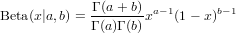
*Exercise 3 : Morris (1997) gives a definition of the beta distribution that differs from the standard statistical parameterization. The standard parameterization is

Suppose we have a (tiny) data set; we can organize it in two different ways, in standard long format or in tabular form:
To get the (sample) probability distribution of the data, just scale by the total sample size:
(dividing by sum(tabdat) would be equivalent).
In the long format, we can take the mean with mean(dat) or, replicating the formula ∑ xi∕N exactly, sum(dat)/length(dat).
In the tabular format, we can calculate the mean with the formula ∑ P(x)x, which in R would be sum(prob*5:8) or more generally
(you could also get the values by as.numeric(levels(prob)), or by sort(unique(dat))).
However, mean(prob) or mean(tabdat) is just plain wrong (at least, I can’t think of a situation where you would want to calculate this value).
Going back the other way, from a table to raw values, we can use the rep() function to repeat values an appropriate number of times. In its simplest form, rep(x,n) just creates a vector repeats x (which may be either a single value or a vector) n times but if n is a vector as well then each element of x is repeated the corresponding number of times: for example,
gives two copies of 1, one copy of 2, and five copies of 3.
Therefore,
will recover our original data (although not in the original order) by repeating each element of vals the correct number of times.
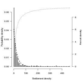
Looking at the data from Schmitt et al. (1999) on damselfish recruitment, the density of settlers nearly fits an exponential distribution with a mean of 24.2 (so λ, the rate parameter, ≈ 1∕24.2: Figure 3). Schmitt et al. also say that recruitment (R) as a function of settlement (S) is R = aS∕(1 + (a∕b)S), with a = 0.696 (initial slope, recruits per 0.1 m2 patch reef per settler) and b = 9.79 (asymptote, recruits per 0.1 m2 patch reef at high settlement density).
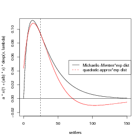
Let’s see how strong Jensen’s inequality is for this population and recruitment function. We’ll figure out the average by approximating an integral by a sum: E[R] = ∫ 0∞f(S)P(S)dS ≈∑ f(Si)P(Si)ΔS, where f(S) is the density of recruits as a function of settlers and P(S)dS is the probability of a particular number of settlers. We need to set the range big enough to get most of the probability of the distribution, and the ΔS small enough to get most of the variation in the distribution; we’ll try 0–200 in steps of 0.1. (If I set the range too small or the ΔS too big, I’ll miss a piece of the distribution or the function. If I try to be too precise, I’ll waste time computing.)
In R:
If you have time, try a few different values for Smax and ΔS to see how the results vary.
R also knows how to integrate functions numerically: it can even approximate an integral from 0 to ∞ (Inf denotes +∞ in R, in contexts where it makes sense). First we have to define a (vectorizable) function:
Then we can just ask R to integrate it:
(Use adaptIntegrate(), in the cubature package, if you need to do multidimensional integrals, and note that if you want to retrieve the numerical value of the integral for use in code you need to say i1$value; use str(i1) to see the other information encoded in i1.)
This integral shows that we were pretty close with our first approximation. However, numerical integration will always imply some level of approximation; be careful with functions with sharp spikes, because it can be easy to miss important parts of the function.
Now to try out the delta function approximation, which is that (E[f(x)] ≈ f() + (σ2f′′()∕2)).
The first derivative is a(1 + ax∕b)-2; the second derivative is -2a2∕b(1 + ax∕b)-3 (confirm this for yourself).
You can calculate the derivatives with the D function in R, but R doesn’t do any simplification, so the results are very ugly:
It’s best, whenever possible, to compute derivatives by hand and only use R to check your results.
As stated above, the mean value of the distribution is about 24.5. The variance of the exponential distribution is equal to the mean squared, or 600.25.
Calculate relative errors of different approaches:
The answer from the delta method is only about -24% below the true value, as opposed to the naive answer (f()) which is about -5% high.______________________
OPTIONAL section:
I also tried this problem in Mathematica, which was able to give me a closed-form
solution to

where ExpIntegralE is an “exponential integral” function (don’t worry about it too much). R can compute the type 2 exponential integral (as specified by the first 2 in the parentheses) via the expint_E2 function in the gsl package (if you want to run this code you have to install the GSL libraries on your computer, too, outside of R):
There is very little difference between the numerical integral and the exact
solution …)
end OPTIONAL section
________________________________________________________________________
A picture …(I’m getting a bit fancy here, using rgb() to define a transparent gray color and then using polygon() to fill an area with this color: I use an x vector that starts at 0, runs to 150, and then runs from 150 to 0, while the y vector first traces out the top of the probability distribution and then runs along zero (the bottom). The transparent gray may not show up in HTML versions of the page, or other places where the graphics system doesn’t support transparency.)
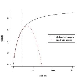
Drawing the thing we’re actually trying to integrate, and its quadratic approximation:
*Exercise 4 : go through the above process again, but this time use a Gamma distribution instead of an exponential. Keep the mean equal to 24.5 and change the variance to 100, 25, and 1, respectively (use the information that the mean of the gamma distribution is shape*scale and the variance is shape*scale^2; use the method of moments). Including the results for the exponential (which is a gamma with shape=1), make a table showing how the (1) true value of mean recruitment [calculated by numerical integration in R either using integrate() or summing over small ΔS] (2) value of recruitment at the mean settlement (3) delta-method approximation (4,5) proportional error in #2 and #3 change with the variance.__________________________________________________________
Optional:
The general recipe for generating samples from finite mixtures is to use a uniform distribution to sample which of the components of the mixture to sample, then use ifelse to pick values from one distribution or the other. To pick 1000 values from a mixture of normal distributions with the parameters shown in the chapter (p = 0.3, μ1 = 1, σ1 = 2, μ2 = 5, σ2 = 1):
The probability density of a finite mixture composed of two distributions D1 and D2 in proportions p1 and 1 -p1 is p1D1 + p2D2. We can superimpose the theoretical probability density for the finite mixture above on the histogram:
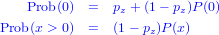
The general formula for the probability distribution of a zero-inflated distribution, with an underlying distribution P(x) and a zero-inflation probability of pz, is:
(the name, dzinbinom, follows the R convention for a probability distribution function: a d followed by the abbreviated name of the distribution, in this case zinbinom for “zero-inflated negative binomial”).
The ifelse() command checks every element of x to see whether it is zero or not and fills in the appropriate value depending on the answer.
A random deviate generator would look like this:
The command runif(n) picks n random values between 0 and 1; the ifelse command compares them with the value of zprob. If an individual value is less than zprob (which happens with probability zprob=pz), then the corresponding random number is zero; otherwise it is a value picked out of the appropriate negative binomial distribution.
optional exercise: Check graphically that these functions actually work. For an extra challenge, calculate the mean and variance of the zero-inflated negative binomial and compare it to the results of rzinbinom(10000,mu=4,size=0.5,zprob=0.2).
The key to compounding distributions in R is that the functions that generate random deviates can all take a vector of different parameters rather than a single parameter. For example, if you were simulating the number of hatchlings surviving (with individual probability 0.8) from a series of 8 clutches, all of size 10, you would say
but if you had a series of clutches of different sizes, you could still pick all the random values at the same time:
Taking this a step farther, the clutch size itself could be a random variable:
We’ve just generated a Poisson-binomial random deviate …
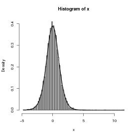
As a second example, I’ll follow Clark et al. in constructing a distribution that is a compounding of normal distributions, with 1/variance of each sample drawn from a gamma distribution.
First pick the variances as the reciprocals of 10,000 values from a gamma distribution with shape 5 (setting the scale equal to 1/5 so the mean will be 1):
Take the square root, since dnorm uses the standard deviation and not the variance as a parameter:
Generate 10,000 normal deviates using this range of standard deviations:
Figure 4 shows a histogram of the following commands:
The superimposed curve is a t distribution with 11 degrees of freedom; it turns out that if the underlying gamma distribution has shape parameter p, the resulting t distribution has df = 2p + 1. (Figuring out the analytical form of the compounded probability distribution or density function, or its equivalence to some existing distribution, is the hard part; for the most part, though, you can find these answers in the ecological and statistical literature if you search hard enough.
**Exercise 5 : Generate 10,000 values from a gamma-Poisson compounded distribution with parameters shape=k = 0.5, scale=μ∕k = 4∕0.5 = 8 and demonstrate that it matches to a negative binomial with the equivalent parameters μ = 4 and k = 0.5.
Optional: generate 10,000 values from a lognormal-Poisson distribution with the same expected mean and variance (the variance of the lognormal should equal the variance of the gamma distribution you used as a compounding distribution; you will have to do some algebra to figure out the values of meanlog and sdlog needed to produce a lognormal with a specified mean and variance. Plot the distribution and superimpose the theoretical distribution of the negative binomial with the same mean and variance to see how different the shapes of the distributions are.
Morris, W. F. 1997. Disentangling effects of induced plant defenses and food quantity on herbivores by fitting nonlinear models. American Naturalist 150:299–327.
Schmitt, R. J., S. J. Holbrook, and C. W. Osenberg. 1999. Quantifying the effects of multiple processes on local abundance: a cohort approach for open populations. Ecology Letters 2:294–303.