The number of women out of 5 testing positive will be Z ~ Bin(5, 0.05), so the probability of 1 or more testing positive is
> pbinom(0,5,.05,low=F)
[1] 0.2262191
With 200 women, the number testing positive will be Y ~ Bin(200, 0.05), so the probability of 3 or more women testing positive is
> pbinom(2,100,.05,low=F)
[1] 0.881737
Let Ai be the event that a woman tests positive at time i, i = 0, 1.
Given: P(A1 | A0) = 0.2, P(A1 | A0c) = 0.042, P(A0) = P(A1) = 0.5
Hence:
P(X=0) = P(A0c * A1c) = P(A1 c | A0c ) P(A0c) = [1 - P(A1 | A0c)] [1 - P(A0)] = 0.9101
P(X=1) = P(A0 * A1c) + P(A0c * A1) = (1-0.2) (0.05) + (0.042) (1 - 0.05) = 0.0799
P(X=2) = P(A0 * A1) = P(A1 | A0) P(A0) = (0.2) (0.05) = 0.01
Note that I have used * to indicate set intersection.
E(X) = 0 (0.9101) + 1 (0.0799) + 2 (0.01) = 0.0999
E(X2) = 0 2 (0.9101) + 1 2 (0.0799) + 2 2 (0.01) = 0.1199
Var(X) = E(X2) - E2(X) = 0.10992
The number that die in the first 4 hours is X1 ~ Bin(20, 0.05), so the probability of 3 or more is
> pbinom(2,20,.05,low=F)
[1] 0.07548367
If 2 die in the first 4 hours, the number dying in the next 4 hours is X2 ~ Bin(18, 0.1), so the probability of 2 or fewer is
> pbinom(2,18,.1)
[1] 0.733796
There is only one way to have 0 rats die over 8 hours: 0 in the first 4 hours and 0 in the next 4 hours, so the probability is
> dbinom(0,20,.05)*dbinom(0,20,.1)
[1] 0.04358352
To solve the problem generally, let Y = X1 + X2 be the number dying over 8 hours. Now, X1 ~ Bin(20, 0.05) and X2 | X1=x ~ Bin(20-x, 0.1), i.e., if you are given that x rats died in the first 4 hours, you know the number dying in the next 4 hours will be distributed Bin(20-x, 0.1). So you have to sum the product of binomial probabilities over all possible values of x, which will be from 0 to y inclusive. The calculation can be done in many different ways; I figured out how to do it in a single line of R and put that line in a function. The complete probability distribution is tabulated below.
> fix(drat)
function (x)
{sum(dbinom(0:x,20,.05)*dbinom(x-(0:x),20-(0:x),.1))
}

> drat(0)
[1] 0.04358352
> drat(1)
[1] 0.1478271
> sapply(0:20,drat)
 [1] 4.358352e-02 1.478271e-01 2.381659e-01 2.423443e-01 1.746721e-01
 [6] 9.479283e-02 4.018994e-02 1.363168e-02 3.756683e-03 8.494643e-04
[11] 1.584673e-04 2.443143e-05 3.107507e-06 3.243102e-07 2.749999e-08
[16] 1.865496e-09 9.886584e-11 3.945111e-12 1.115090e-13 1.990619e-15
[21] 1.687952e-17
If we assume that the number of deaths is X ~ Pois(15.6), the probability of exactly 51 deaths is
> dpois(51,15.6)
[1] 7.650953e-13
The probability of 51 or more deaths would be
> ppois(50,15.6,low=F)
[1] 1.089354e-12
which is very small, indicating that 51 deaths is unusually high.
You can solve for the maximum number of deaths consistent with a cutoff of 0.05 either by using the poisson quantile function qpois() directly or the tail probability function ppois() by trial and error. The answer is 23.
> qpois(.95,15.6)+1
[1] 23
> qpois(.05,15.6,low=F)+1
[1] 23
> ppois(22,15.6,low=F)
[1] 0.04675709
The probability that a young person (age 1 - 14) is hypertensive is P(X>115) where X ~ N(105, 25)
> p1 <- 1 - pnorm(115,105,5)
> p1
[1] 0.02275013
The probability that an older person (age 15 - 44) is hypertensive is P(X>140) where X ~ N(125, 100)
> p2 <- 1 - pnorm(140,125,10)
> p2
[1] 0.0668072
The probability that a family is hypertensive, defined that at least one of two young people and two older people is hypertensive, is 1 minus the probability that none of the four are hypertensive, which, assuming independence, is
> pf <- 1 - ((1-p1)^2)*((1-p2)^2)
> pf
[1] 0.1683243
The number of families out of 200 who are hypertensive is, assuming independence, Bin(200, pf), so the probability of having between 10 and 25 families, inclusive, is
> pbinom(25,200,pf) - pbinom(9,200,pf)
[1] 0.05742685
which could also be computed by the normal approximation to the binomial as
> pnorm(25.5,200*pf,sqrt(200*pf*(1-pf))) - pnorm(9.5,200*pf,sqrt(200*pf*(1-pf)))
[1] 0.0614053
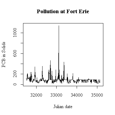
The time sequence plot shows annual cycles peaking in the late spring and occasional extreme high values. It also appears that some high values have been truncated; in the second half of the series few values exceed 89 and many are exactly 89 ng/g, and this shows as a horizontal band on the plot. There is a similar but less pronounced effect in the first half, suggesting that in the first four years a few high values were truncated at 77 ng/g. Because of the truncation, it is hard to say whether or not there is any trend. We would hope that the level of PCB is decreasing over time but we can't see that here because of the truncation.
There is a single extreme peak on 1993-09-16. Perhaps there would have been more peaks like this later in the series; we can't tell because the upper detection limit was encountered so often.
The only evident change point seems to be a change in protocol rather than a change in pollution levels: about half-way through the series, the upper detection limit of 89 ng/g seems to be applied much more often.
I have plotted against Julian date. The result is almost the same as a plot against row index because the sampling followed a weekly schedule quite closely. If sampling was more irregular in time, the plot against Julian date would be better than the row-index plot for indicating seasonal or annual cycles.
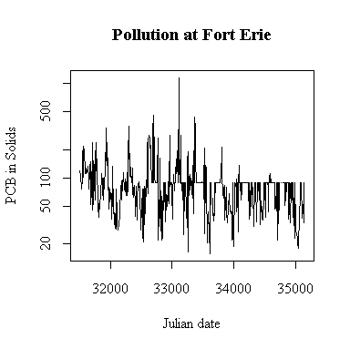
Plotting on a log scale makes the cycles easier to see; the ups and downs are more symmetric. On the other hand, if we are only interested in high levels of pollution, the plot in original units is perhaps more informative, the log plot puts too much emphasis on the low values.
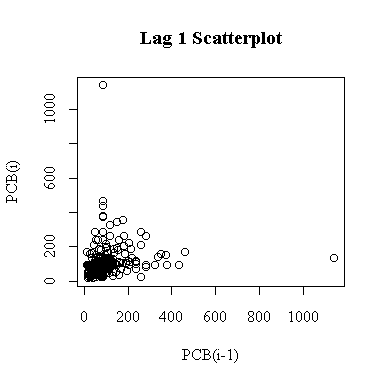
The lag-1 scatter plot is not of much use because it is dominated by two outliers. Note that because each point appears once on the ordinate and once on the abscissa, the single extreme peak on 1993-09-16 generates both outliers.
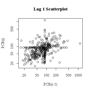
On a log scale, the lag-1 plot is easier to interpret and reveals some autocorrelation. The two outliers are much less prominent. The upper limit of detection at 89 ng/g appears as a horizontal band and a vertical band.
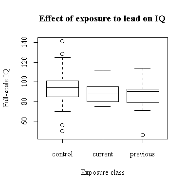
The classification into control, currently exposed and previously exposed was based on the Lead.type variable. The distribution of Full-scale IQ appears to be identical in the current and previous groups; the control group has a slightly higher median and a wider range. (Later in the course we can see if these differences are statistically significant.)
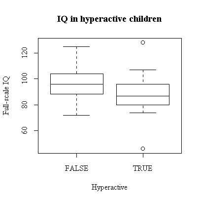
While full-scale IQ appears to be generally lower in the hyperactive children, this is an observational study so there is no implication of causation in either direction. Also, there are other factors in this study, such as exposure to lead, that do nit figure in this graph. It is, however, suggestive.
How could you study the three variables IQ, hyperactivity and exposure to lead, all at once?
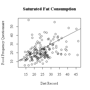
The relationship between the diet record and the food frequency questionnaire is very weak for saturated fat consumption. More points lie below the diagonal than above, indicating a tendency for the FFQ to underestimate saturated fat.
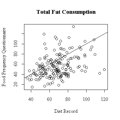
The relationship between the diet record and the food frequency questionnaire is very weak for total fat consumption. More points lie below the diagonal than above, indicating a tendency for the FFQ to underestimate total fat.
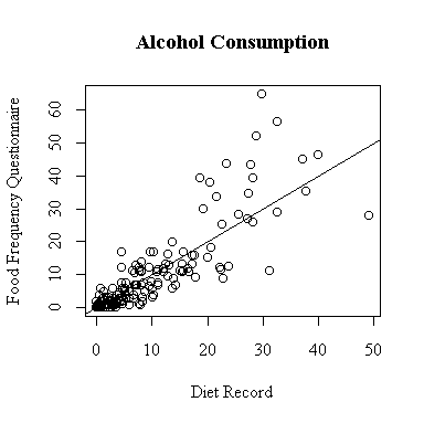
There seem to be two groups, light drinkers and heavy drinkers. The lightest drinkers tend to underestimate their alcohol consumption a little on the FFQ, the heavy drinkers tend to overestimate alcohol consumption by a lot.
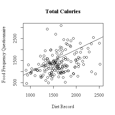
The relationship between the diet record and the food frequency questionnaire is very weak for total calories consumed. More points lie below the diagonal than above, indicating a tendency for the FFQ to underestimate total calories.
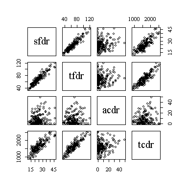
The pairs plot (sometimes called a scatterplot matrix, or SPLOM) shows the strongest linear relationships between saturated fat and total fat and between total fat and total calories, and almost as strong a relationship between saturated fat and total calories. Alcohol consumption does not appear to be related to any of the other three nutrition indicators.
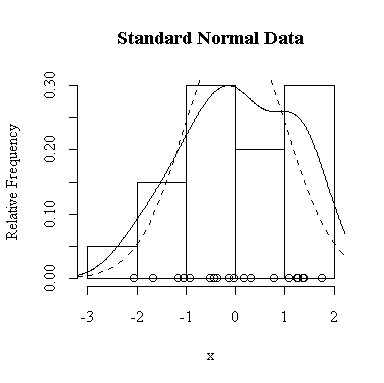
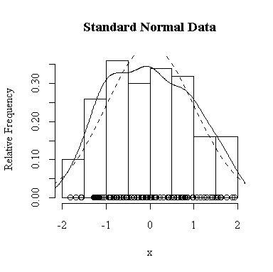
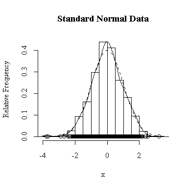
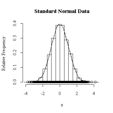
I have done this exercise for 20, 100, 1000 and 10000 observations. It is hard to say for sure, and every simulation will be different, but usually you will find that with about 100 or more observations the histogram and the density estimate give a reasonable appearance of normality. With 10000 observations the density estimate is extremely close to the true distribution, but even then the top of the peak will not be estimated perfectly.
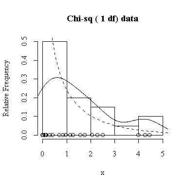
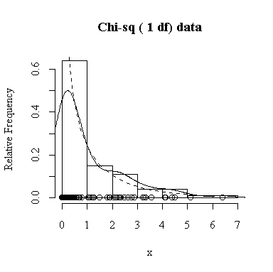
Similarly, for the chi-square distribution on 1 degree of freedom, 100 observations start to give a good representation of the shape, 10000 observations give a consistently good estimate.
To apply Equation 5.10 on p. 135, let each observation have the same mean m and the same standard deviation s and let L be the sample mean xbar. You can easily show that in this special case, E(L) = m and Var(xbar) = s 2/n.
The Central Limit Theorem, Equation 6.3 on p. 174, says that the distribution of the sample mean will be exactly normal if the data are normal, and approximately normal with large samples even if the data are not normal.
Our experience in the previous question suggests that 200 samples and 200 values of xbar will be enough to give a good indication of the sampling distribution of the sample mean.
The histogram indicates normality.
For this example, n = 4 so we know E(xbar) = 0, Var(xbar) = 1/4 = 0.25, SD(xbar) = 0.5. We observed:
> mean(xbars)
[1] 0.002038315
> var(xbars)
[1] 0.2414302
> sqrt(var(xbars))
[1] 0.4913555
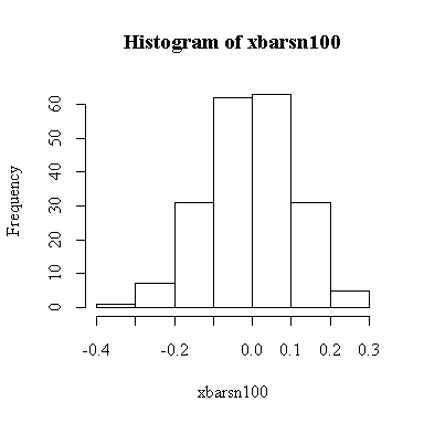
The histogram indicates normality.
For this example, n = 100 so we know E(xbar) = 0, Var(xbar) = 1/100 = 0.01, SD(xbar) = 0.1. We observed:
> mean(xbarsn100)
[1] -0.00457578
> var(xbarsn100)
[1] 0.01136128
> sqrt(var(xbarsn100))
[1] 0.1065893
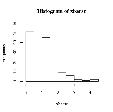
The histogram indicates that the distribution of xbar is positively skewed, albeit less skewed than the chi-square on 1 df. The sample size isn't large enough here for the central limit theorem to ensure a good approximation.
Since we know that the chi-square distribution has mean equal to the degrees of freedom and variance equal to twice the degrees of freedom, we know that when n = 4, E(xbar) = 1, Var(xbar) = 2/4 = 0.5, and SD(xbar) = sqrt(0.5) = 0.7071. We observed:
> mean(xbarsc)
[1] 1.073543
> var(xbarsc)
[1] 0.6227482
> sqrt(var(xbarsc))
[1] 0.789144
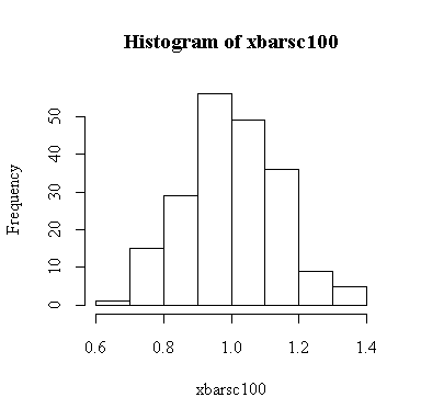
The sample size is large enough here for the central limit theorem to ensure that the distribution of the sample mean is close to a normal distribution.
Since we know that the chi-square distribution has mean equal to the degrees of freedom and variance equal to twice the degrees of freedom, we know that when n = 100, E(xbar) = 1, Var(xbar) = 2/100 = 0.02, and SD(xbar) = sqrt(0.02) = 0.1414. We observed:
> mean(xbarsc100)
[1] 1.004506
> var(xbarsc100)
[1] 0.01946944
> sqrt(var(xbarsc100))
[1] 0.1395329