These are model solutions; they are intended to be complete, with graphs that bring out the information in the data as efficiently and as effectively as possible. Students should get full marks if they arrive at valid conclusions and support them effectively with appropriate graphs and (less importantly) numerical summaries. The graphs do not always have to be exactly the same as mine. [Full marks = 115].
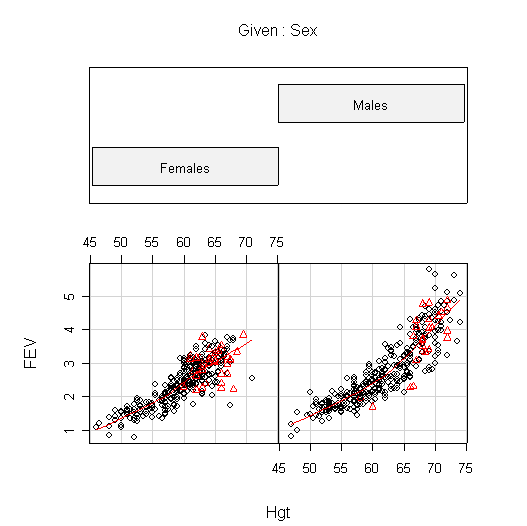
> FEV$Smoke <- factor(FEV$Smoke)
> coplot(FEV~Hgt|Sex,data=FEV,pch=as.numeric(FEV$Smoke),col=as.numeric(FEV$Smoke),panel=panel.smooth)
> coplot(FEV~Age|Sex,data=FEV,pch=as.numeric(FEV$Smoke),col=as.numeric(FEV$Smoke),panel=panel.smooth)
> coplot(Hgt~Age|Sex,data=FEV,pch=as.numeric(FEV$Smoke),col=as.numeric(FEV$Smoke),panel=panel.smooth)
> boxplot(FEV~Smoke:Sex,data=FEV[FEV$Age>12,])
> title(ylab="FEV",sub="0 = noncurrent smokers, 1 = smokers",main="FEV for Children Age > 12")
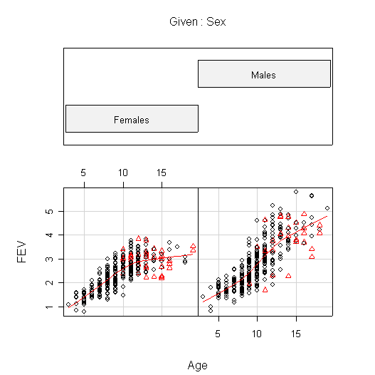
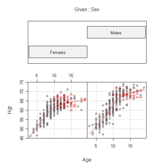
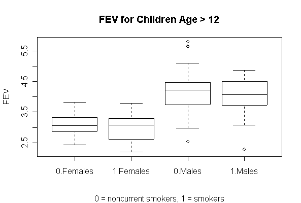
I used coplot() to put males and females into comparable panels, and I used panel=panel.smooth to add a lowess line to each panel. I am not expecting you to use these advanced features but I am expecting you to get graphs more or less like these.
The plots of FEV against Hgt show the clearest relationship; it is nearly linear for females but shows increasing slope for males.
The plots of FEV against Age are very similar to the plots of Hgt against Age. In females, FEV and Hgt both increase linearly until about age 10, then begin to level off. Males appear to follow the same linear growth as females but they continue to grow until about age 13, so when growth levels off the average FEV is about 1 L greater in males than in females, and the average height is about 5 in. taller.
The comparative box plots compare FEV in males and females, smokers and non-smokers, for ages 13 and up, after growth has leveled off. They show that the median FEV is about 1 L higher in males than in females, and there is no difference between smokers and non-smokers.
Here are the calculations that support these figures:
> mean(FEV$FEV[FEV$Age>12 & FEV$Sex=="Males"])
[1] 4.124758
> mean(FEV$FEV[FEV$Age>12 & FEV$Sex=="Females"])
[1] 3.007236
> mean(FEV$FEV[FEV$Age>12 & FEV$Sex=="Males"])- mean(FEV$FEV[FEV$Age>12 & FEV$Sex=="Females"])
[1] 1.117522
> mean(FEV$Age[FEV$Age>12 & FEV$Sex=="Males"])
[1] 14.67742
> mean(FEV$Hgt[FEV$Age>12 & FEV$Sex=="Males"])
[1] 69.10484
> mean(FEV$Hgt[FEV$Age>12 & FEV$Sex=="Females"])
[1] 64.30727
> mean(FEV$Hgt[FEV$Age>12 & FEV$Sex=="Males"])- mean(FEV$Hgt[FEV$Age>12 & FEV$Sex=="Females"])
[1] 4.797566
I couldn't think of any other numeric measures that added anything to the information from the graphs.
 |
 |
 |
 |
 |
 |
 |
 |
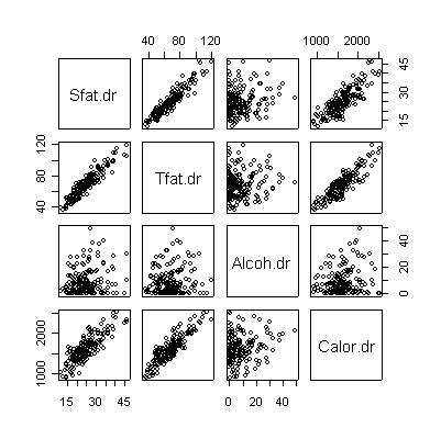
> pairs(valid[,c(2,4,6,8)]) |
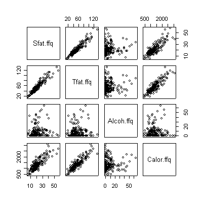
> pairs(valid[,c(3,5,7,9)]) |
 |
 |
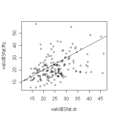 |
> plot(valid$Sfat.dr,valid$Sfat.ffq)
> abline(0,1)
> cor(valid$Sfat.dr,valid$Sfat.ffq)
[1] 0.403432
|
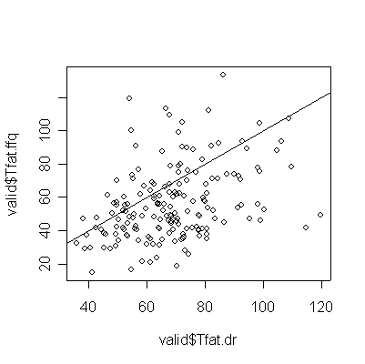 |
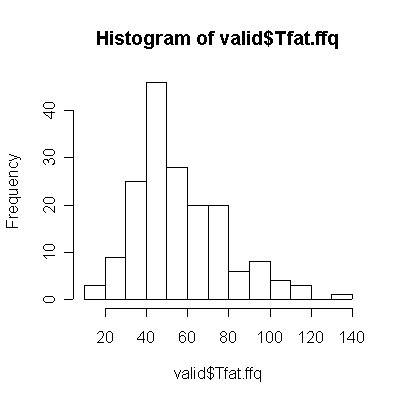
> plot(valid$Tfat.dr,valid$Tfat.ffq) > abline(0,1) > cor(valid$Tfat.dr,valid$Tfat.ffq) [1] 0.3696641 |
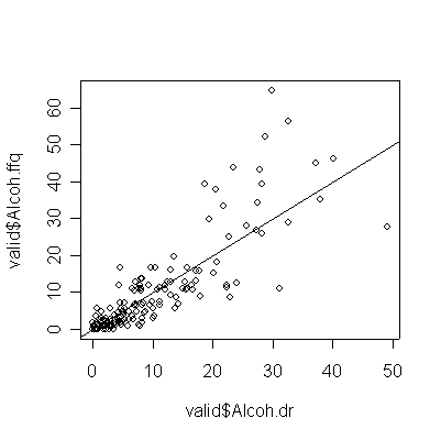 |
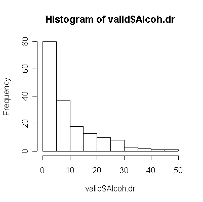
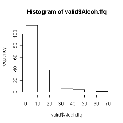
> plot(valid$Alcoh.dr,valid$Alcoh.ffq) > abline(0,1) > cor(valid$Alcoh.dr,valid$Alcoh.ffq) [1] 0.8498838 |
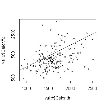 |
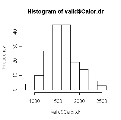
> plot(valid$Calor.dr,valid$Calor.ffq) > abline(0,1) > cor(valid$Calor.dr,valid$Calor.ffq) [1] 0.3559695 |
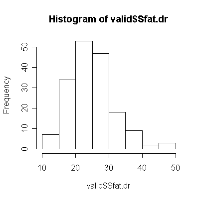
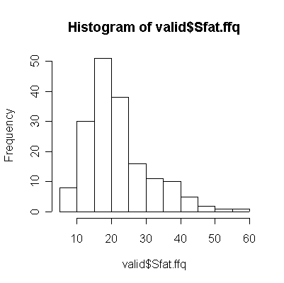
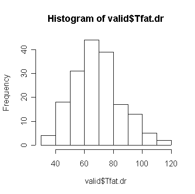
For saturated fat, total fat, and total calories, the Food Frequency Questionnaire (FFQ) tends to underestimate consumption compared to the Diet Record (DR) (more points lie below the diagonal than above), and the correlation between the two is too low (0.4 or less) for the FFQ to be of any use as a substitute for DR.
The correlation is much higher for alcohol, but that is because the non-drinkers and light drinkers had good recall of the amount consumed. Light drinkers slightly underestimated their consumption, while the heavy drinkers seriously overestimate their consumption (more points below the diagonal than above for 20 oz. or less, more points above the diagonal than below for 20 oz. or more).
The scatterplot matrices for DR and FFQ are almost identical to each other. In each case, saturated fat and total fat have a very strong linear correlation and each is correlated with total calories. Alcohol is not correlated with anything. Here are the corresponding correlation coefficients:
> cor(valid[,c(2,4,6,8)])
           Sfat.dr    Tfat.dr   Alcoh.dr  Calor.dr
Sfat.dr  1.0000000 0.93173471 0.18141753 0.8262041
Tfat.dr  0.9317347 1.00000000 0.09584735 0.8845388
Alcoh.dr 0.1814175 0.09584735 1.00000000 0.2015217
Calor.dr 0.8262041 0.88453882 0.20152169 1.0000000
> cor(valid[,c(3,5,7,9)])
            Sfat.ffq   Tfat.ffq     Alcoh.ffq     Calor.ffq
Sfat.ffq  1.00000000 0.94518766  0.0837861647  0.8278180942
Tfat.ffq  0.94518766 1.00000000  0.0760384810  0.8862180190
Alcoh.ffq 0.08378616 0.07603848  1.0000000000 -0.0005010716
Calor.ffq 0.82781809 0.88621802 -0.0005010716  1.0000000000
To simplify creating the quintile tables, I wrote a function I called quantable(). It can also give quartile tables, e.g., if you set nclass = 4 when you call it.
> quantable <-
function (x, y, nclass = 5)
{
    table(cut(x, quantile(x, seq(0, 1, by = 1/nclass)), include.lowest = T),
        cut(y, quantile(y, seq(0, 1, by = 1/nclass)), include.lowest = T))
}
> quantable(valid$Sfat.dr,valid$Sfat.ffq)

              [5.6,14.8] (14.8,18.3] (18.3,22] (22,27.7] (27.7,57.4]
  [11.8,18.8]         15           8         9         2           1
  (18.8,22.6]          9           6         6         7           6
  (22.6,26]            5           7         8         9           6
  (26,29.5]            5          10         6         9           4
  (29.5,46.4]          1           3         6         7          18
> quantable(valid$Tfat.dr,valid$Tfat.ffq)

              [14.8,38.1] (38.1,47.1] (47.1,56.3] (56.3,73] (73,134]
  [35.9,54.1]          13           9           8         5        1
  (54.1,64.3]           9           5           7         8        4
  (64.3,71]             4          10           8         7        6
  (71,80.5]             7           6           3         9        9
  (80.5,120]            2           4           9         5       15
> quantable(valid$Alcoh.dr,valid$Alcoh.ffq)

              [0,0.76] (0.76,2.57] (2.57,6.66] (6.66,12.9] (12.9,64.8]
  [0,0.87]          31           2           2           0           0
  (0.87,4.1]        17          11           6           0           0
  (4.1,8.09]         2           8          14          10           1
  (8.09,15.7]        0           1          10          15           8
  (15.7,49.1]        0           0           0           9          26
> quantable(valid$Calor.dr,valid$Calor.ffq)

                        [463,981] (981,1.21e+003] (1.21e+003,1.39e+003]
  [910,1.37e+003]              10              11                     8
  (1.37e+003,1.53e+003]        11               4                     9
  (1.53e+003,1.67e+003]         5               8                     7
  (1.67e+003,1.87e+003]         4               8                     7
  (1.87e+003,2.52e+003]         5               3                     4

                        (1.39e+003,1.7e+003] (1.7e+003,3.08e+003]
  [910,1.37e+003]                          4                    2
  (1.37e+003,1.53e+003]                    6                    4
  (1.53e+003,1.67e+003]                    8                    7
  (1.67e+003,1.87e+003]                    6                    9
  (1.87e+003,2.52e+003]                   10                   13
>
The quintile tables give the same impression as the scatter plots; only the alcohol table shows a strong diagonal.
Converting to total fat to Nutrient Density increases the correlation and tightens the graph, but the correlation between FFQ and DR is still weak and FFQ still underestimates DR.
> valid$TfatND.ffq <- 100*9*valid$Tfat.ffq/valid$Calor.ffq
> valid$TfatND.dr <- 100*9*valid$Tfat.dr/valid$Calor.dr
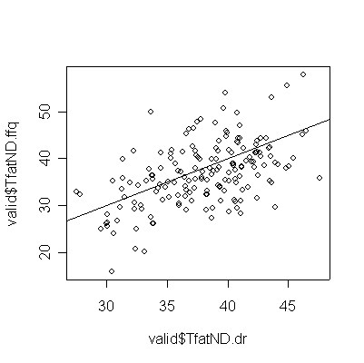 |
> plot(valid$TfatND.dr,valid$TfatND.ffq) > abline(0,1) > cor(valid$TfatND.dr,valid$TfatND.ffq) [1] 0.5146777 |
The quintile table now shows a strong diagonal, indicating good correspondence between FFQ and DR for Total Fat Nutrient Density.
> quantable(valid$TfatND.dr,valid$TfatND.ffq)

              [15.9,31.4] (31.4,35.2] (35.2,38.4] (38.4,41.7] (41.7,57.8]
  [27.5,34]            19           6           7           2           1
  (34,37.3]             5          14           5           5           5
  (37.3,39.8]           4           8          10           7           6
  (39.8,41.6]           6           3           7           6          12
  (41.6,47.6]           1           3           6          14          11
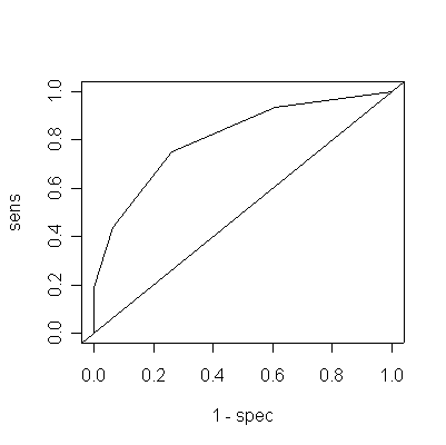
Note that a low score indicates dementia. With a cutoff of <= 20, we get
sensitivity = 12/16 = 0.75
specificity = 34/46 = 0.739
> dem
[1] 0 2 1 4 5 3 1
> sens <- cumsum(dem)/sum(dem)
> nondem
[1]  0  0  0  3  9 16 18
> spec <- 1 - cumsum(nondem)/sum(nondem)
> data.frame(cutoff=seq(0,30,by=5),sens,spec)
  cutoff   sens      spec
1      0 0.0000 1.0000000
2      5 0.1250 1.0000000
3     10 0.1875 1.0000000
4     15 0.4375 0.9347826
5     20 0.7500 0.7391304
6     25 0.9375 0.3913043
7     30 1.0000 0.0000000
> plot(1-spec,sens,type="l")
> abline(0,1)
The cutoff at 20 is the only cutoff that gives both sensitivity and specificity > 70%.
To get the are under the ROC curve, note that the area of a trapezoid (a rectangle with a triangle on top) is the width times the average height. This is easy enough to work through by hand; if you want a single R command to compute the area of all 6 trapezoids and add them up, this does it:
> sum(.5*((1-spec)[-1]-(1-spec)[-7])*(sens[-1]+spec[-7]))
[1] 0.7754903
This means that if you randomly select one normal subject and one subject with dementia and apply the test to each and declare the subject with the lower test score of the two to be the one with dementia, you will be correct 77.5% of the time. (Since in practice you are not likely to be in this situation, this is not a very useful interpretation!)
If we consider this a random sample of 5034 individuals from the population of males aged 50-59, then the table can be interpreted equally well by rows or by columns.
Sensitivity = 124/888 = 13.96%
Specificity = 3851/4146 = 92.88%
Prevalence = 888/5034 = 17.64%
PV+ = 124/419 = 29.59%
PV- = 3851/4615 = 83.44%
If the threshold were changed from 100+ to 95+ the sensitivity would increase, unless there were no 10-year mortalities with DBP in the range 95-100 mm Hg in which case it would remain the same. The specificity would decrease, unless there were no 10-year mortalities with DBP in the range 95-100 mm Hg in which case it would remain the same.
> niagara <- read.table("niagara.txt",head=T,sep="\t",fill=T)
> dim(niagara)
[1] 965 13
> names(niagara)
[1] "STATION" "DATE" "JULIAN.DATE" "DISCHARGE" "SEDIMENT"
[6] "DIE.H2O" "DIE.H2O.DL" "DIE.SOL" "DIE.SOL.DL" "PCB.H2O"
[11] "PCB.H2O.DL" "PCB.SOL" "PCB.SOL.DL"
> pcbwfe <- niagara$PCB.H2O[niagara$STATION=="FE"]
> pcbwnl <- niagara$PCB.H2O[niagara$STATION=="NOTL"]
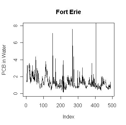
> plot(pcbwfe,ylab="PCB in Water", main="Fort Erie", type="l", ylim=c(0,8))
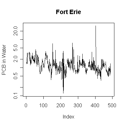
> plot(pcbwfe,ylab="PCB in Water", main="Fort Erie", type="l", log="y")
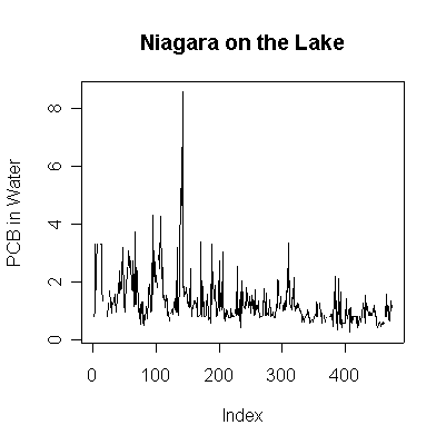
> plot(pcbwnl,ylab="PCB in Water", main="Niagara on the Lake", type="l")
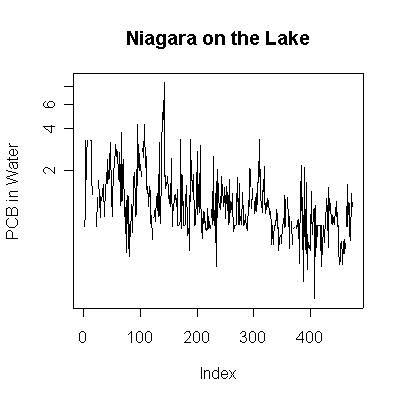
> plot(pcbwnl,ylab="PCB in Water", main="Niagara on the Lake", type="l", log="y")
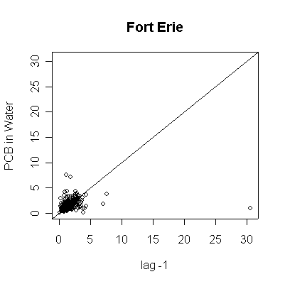
> plot(pcbwfe[-length(pcbwfe)],pcbwfe[-1],ylab="PCB in Water",xlab="lag -1",main="Fort Erie")
> abline(0,1)
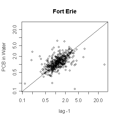
> plot(pcbwfe[-length(pcbwfe)],pcbwfe[-1],ylab="PCB in Water",xlab="lag -1",main="Fort Erie",log="xy")
> abline(0,1)
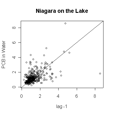
> plot(pcbwnl[-length(pcbwnl)],pcbwnl[-1],ylab="PCB in Water",xlab="lag -1",main="Niagara on the Lake")
> abline(0,1)
> plot(pcbwnl[-length(pcbwnl)],pcbwnl[-1],ylab="PCB in Water",xlab="lag -1",main="Niagara on the Lake",log="xy")
> abline(0,1)
 |
 |
 |
 |
 |
 |
 |
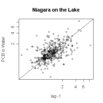 |
Since the data are more or less weekly, 50 points are about one year. Annual cycles are evident, with peaks in April and May. The Fort Erie series shows a steady downward trend, the Niagara on the Lake data do not show a downward trend until about the fourth year, suggesting a change point around 1989. Fort Erie has more extreme high values than Niagara on the Lake. The log transformation reduces the impact of the very high values and makes the cycles and trends easier to see.
There seem to be upper (3.3) and lower (0.81) detection limits some of the time, but they are not evident in any of the graphs. It is possible that the upper detection limits hide some extreme high values. The one very high reading of 30.6 on 1994-06-15 is suspect; it is so much higher than any other reading it should be checked out as a possible transcription error.
The lag -1 plots indicate autocorrelation in the series. Again, the log transformation makes the lag plots clearer by reducing the effect of the extreme values.
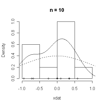
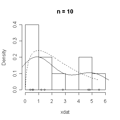
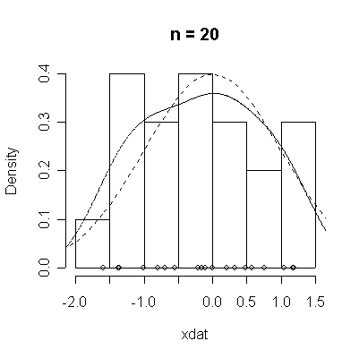
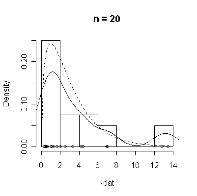
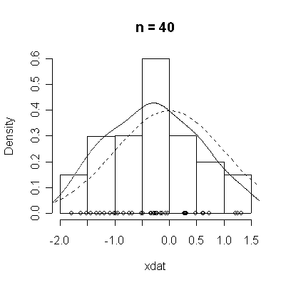
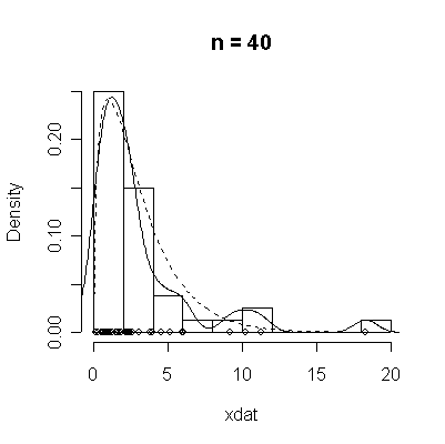
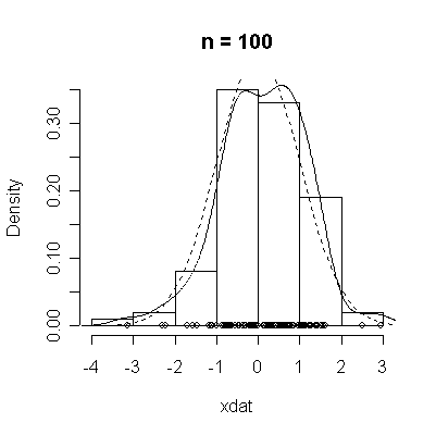
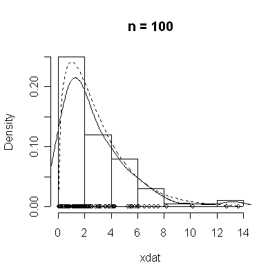
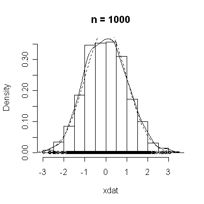
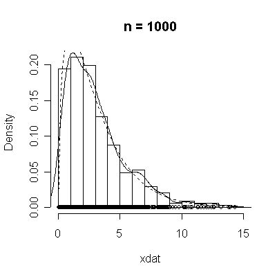
The conventional answer is that you need at least 30 or 40 observations before you can estimate the shape of a distribution, but it is interesting to note how far from the theoretical distributions these examples are even when n = 100.
| Standard Normal | Chi-square on 3 d.f. |
normdat <-
function (n = 50)
{
    xdat <- rnorm(n)
    hist(xdat, prob = T, main = paste("n =", n))
    lines(density(xdat))
    points(xdat, rep(0, n))
    xgr <- seq(-4, 4, length = 100)
    lines(xgr, dnorm(xgr), lty = 2)
}
|
> chisqdat
function (n = 50, df = 3)
{
    xdat <- rchisq(n, df)
    hist(xdat, prob = T, main = paste("n =", n))
    lines(density(xdat))
    points(xdat, rep(0, n))
    xgr <- seq(0, max(xdat), length = 100)
    lines(xgr, dchisq(xgr, df), lty = 2)
}
|
 |
 |
 |
 |
 |
 |
 |
 |
 |
 |