Even though the data rounded to the nearest 0.5 were already in the data file, I recomputed the rounded values (z1rr, z2rr) just to show how to do the rounding in Splus.
Begin by saving the bivariate normal data file from the web site as a text file called binormdat.txt. Edit it to remove the comments at the top. Read the file into a data frame in Splus.
> binorm <- read.table("binormdat.txt",header=T)
> binorm[1:10,]
         Z1       Z2  Z1R  Z2R
 1 -0.83923 -0.09391 -1.0  0.0
 2 -0.49464 -0.95089 -0.5 -1.0
 3 -0.23595 -0.39965  0.0 -0.5
 4  0.44705 -1.17349  0.5 -1.0
 5 -0.42167  1.31421 -0.5  1.5
 6  1.35469  1.33031  1.5  1.5
 7 -0.62061 -1.56261 -0.5 -1.5
 8 -0.25408  0.71974 -0.5  0.5
 9 -0.53801  0.50476 -0.5  0.5
10 -1.21637  0.96843 -1.0  1.0
> binorm$z1rr <- round(binorm$Z1*2)/2
> binorm$z2rr <- round(binorm$Z2*2)/2
> binorm[1:5,]
        Z1       Z2  Z1R  Z2R z1rr z2rr
1 -0.83923 -0.09391 -1.0  0.0 -1.0  0.0
2 -0.49464 -0.95089 -0.5 -1.0 -0.5 -1.0
3 -0.23595 -0.39965  0.0 -0.5  0.0 -0.5
4  0.44705 -1.17349  0.5 -1.0  0.5 -1.0
5 -0.42167  1.31421 -0.5  1.5 -0.5  1.5
> binormtab <- table(binorm$z1rr, binorm$z2rr)
> binormtab
     -3 -2.5 -2 -1.5 -1 -0.5  0 0.5  1 1.5 2 2.5 3
-2.5  0    0  1    0  1    0  0   0  0   0 0   0 0
  -2  1    0  0    0  2    1  2   0  2   2 0   0 0
-1.5  0    0  2    2  4    7 11   7  4   3 1   1 0
  -1  0    0  3    4  5    7 17  10  4   6 1   2 1
-0.5  0    2  0   14  7   11 19  18  6   4 2   1 0
   0  0    0  2    8  7   19 23  22 12   7 1   1 0
 0.5  1    1  2   12 13   22 15  12  8   6 2   2 0
   1  1    0  2    7  3    6 13   8  4   4 1   1 0
 1.5  0    1  1    3  2    9  8   5  3   2 0   1 0
   2  0    0  0    0  1    1  4   3  1   2 0   0 0
 2.5  0    0  0    0  3    1  0   0  0   0 0   0 0
   3  0    0  0    0  1    1  0   0  0   0 0   0 0
 3.5  0    0  0    1  0    0  0   0  0   0 0   0 0
> btrow <- dimnames(binormtab)[[1]]
> btcol <- dimnames(binormtab)[[2]]
> btrow
 [1] "-2.5" "-2"   "-1.5" "-1"   "-0.5" "0"    "0.5"  "1"    "1.5"  "2"
[11] "2.5"  "3"    "3.5"
> btcol
 [1] "-3"   "-2.5" "-2"   "-1.5" "-1"   "-0.5" "0"    "0.5"  "1"    "1.5"
[11] "2"    "2.5"  "3"
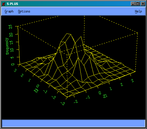
The row and column labels from the table were extracted with the dimnames function and saved in btrow and btcol. This makes them conveniently available for the axes of the perspective plot.
> persp(btrow,btcol,binormtab,xlab="Z1",ylab="Z2",zlab="frequency")
You will note some differences from the Excel graphs in Lecture #02; the table of frequencies is transposed and on the frequency polygon the Z2 axis runs the opposite direction. The graph was much easier to draw in Splus.