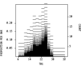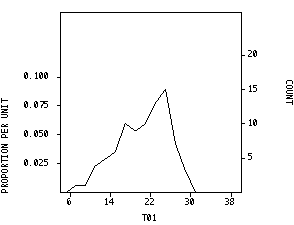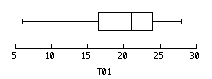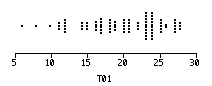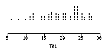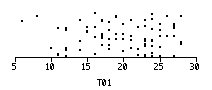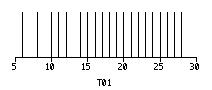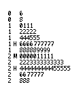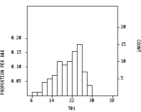
All the following graphs were drawn in Systat from the same data (n = 84 observations). The data are students' marks on a class test out of 30. Would you use a normal density function to describe these data? Why or why not?
Which graphs are the most helpful in revealing the underlying probability distribution? Which are the most helpful in interpreting the data? Which of these graphs can you do in other packages (Splus, Minitab, SPSS, SAS)?