Exploratory data analysis and graphics: lab 2
© 2005 Ben Bolker
This lab will cover many if not all of the
details you actually need to know about R to
read in data and produce the figures shown in
Chapter 2, and more.
The exercises, which will be considerably more
difficult than those in Lab 1, will typically
involve variations on the figures shown in the
text. You will work through reading in
the different data sets and constructing the
figures shown, or variants of them. It would
be even better to work through reading in
and making exploratory plots of your own data.
1 Reading data
Find the file called seedpred.dat:
it's in the right format (plain text, long format),
so you can just read it in with
> data = read.table("seedpred.dat", header = TRUE)
(remember not to copy the > if you
are cutting and pasting from this document).
Add the variable available
to the data frame by
combining taken and remaining
(using the $ symbol):
> data$available = data$taken + data$remaining
Pitfall #1: finding your file
If R responds to your read.table() or
read.csv() command
with an error like
Error in file(file, "r") : unable to open connection
In addition: Warning message: cannot open file 'myfile.csv'
it means it can't find your file, probably because it isn't looking in the right place.
By default, R's working directory is the directory in which
the R program starts up, which is (again by default) something like
C:/Program Files/R/rw2010/bin. ( R uses /
as the [operating-system-independent]
separator between directories in a file path.)
The simplest way to change this for the duration of your R session
is to go to File/Change dir ..., click on the Browse
button, and move to your Desktop (or wherever your file is located).
You can also use the setwd() command to set the
working directory (getwd() tells you what
the current working directory is).
While you could just throw everything on your desktop,
it's good to get in the habit of setting up a
separate working directory for different projects, so that
your data files, metadata files, R script files, and so forth, are all in
the same place.
Depending on how you have gotten your data files onto your system
(e.g. by downloading them from the web), Windows
will sometimes hide or otherwise screw up the extension of your
file (e.g. adding .txt to a file called mydata.dat).
R needs to know the full name of the file, including the extension.
Pitfall #2: checking number of fields
The next potential problem is that R needs every line of your data file to have the
same number of fields (variables). You may get an error like:
Error in read.table(file = file, header = header, sep = sep, quote = quote,  :
        more columns than column names
or
Error in scan(file = file, what = what, sep = sep, quote = quote, dec = dec,  :
        line 1 did not have 5 elements
If you need to check on the number of fields that
R thinks you have on each line, use
> count.fields("myfile.dat", sep = ",")
(you can omit the sep="," argument if
you have whitespace- rather than comma-delimited
data).
If you are checking a long data file you can try
> cf = count.fields("myfile.dat", sep = ",")
> which(cf != cf[1])
to get the line numbers with numbers of fields
different from the first line.
By default R will try to fill in what it sees
as missing fields with NA ("not available")
values; this can be useful but can also hide
errors. You can try
> mydata <- read.csv("myfile.dat", fill = FALSE)
to turn off this behavior; if you don't
have any missing fields at the end of lines
in your data this should work.
1.1 Checking data
Here's the quickest way to check that all your variables have
been classified correctly:
> sapply(data, class)
  Species      tcum      tint remaining     taken available
 "factor" "integer" "integer" "integer" "integer" "integer"
(this applies the class() command, which identifies
the type of a variable, to each column in your data).
Non-numeric missing-variable strings
(such as a star, *) will also make R
misclassify. Use na.strings
in your read.table() command:
> mydata <- read.table("mydata.dat", na.strings = "*")
(you can specify more than one value with (e.g.)
na.strings=c("*","***","bad","-9999")).
Exercise 1: Try out
head(), summary() and str()
on data; make sure you understand the results.
1.2 Reshaping data
It's hard to give an example of reshaping the
seed predation data set because we have
different numbers of observations for each
species - thus, the data won't fit nicely
into a rectangular format with (say) all
observations from each species on the same
line.
However, as in the chapter text I can
just make up a data frame and reshape it.
Here are the commands to generate the
data frame I used as
an example in the text (I use LETTERS,
a built-in vector of the capitalized letters
of the alphabet, and runif(), which
picks a specified number of random numbers
from a uniform distribution between 0 and 1.
The command round(x,3)
rounds x to 3 digits after the decimal place.):
> loc = factor(rep(LETTERS[1:3], 2))
> day = factor(rep(1:2, each = 3))
> val = round(runif(6), 3)
> d = data.frame(loc, day, val)
This data set is in long format.
To go to wide format:
> d2 = reshape(d, direction = "wide", idvar = "loc", timevar = "day")
> d2
  loc val.1 val.2
1   A 0.362 0.598
2   B 0.522 0.692
3   C 0.722 0.697
idvar="loc" specifies
that loc is the
identifier that should be used to assign multiple
values to the same row,
and timevar="day" specifies which variable
can be lumped together on the same row.
To go back to long format:
> reshape(d2, direction = "long", varying = c("val.1", "val.2"),
+     timevar = "day", idvar = "loc")
    loc day   val
A.1   A   1 0.362
B.1   B   1 0.522
C.1   C   1 0.722
A.2   A   2 0.598
B.2   B   2 0.692
C.2   C   2 0.697
varying specifies which variables are changing
and need to be reshaped, and timevar
specifies the name of the variable to be (re)created
to distinguish different samples in the same location.
Exercise 2: unstack() works with
a formula. Try unstack(d,val~day) and
unstack(d,val~loc) and figure out what's going on.
1.3 Advanced data types
While you can usually get by coding data in
not quite the right way - for example, coding dates
as numeric values or categorical variables as
strings - R tries to "do the right
thing" with your data, and it is more likely to
do the right thing the more it knows about how your
data are structured.
Strings instead of factors
Sometimes R's default of assigning factors is not what you want: if
your strings are unique identifiers (e.g. if you have a code for
observations that combines the date and location of sampling, and each
location combination is only sampled once on a given date) then R's
strategy of coding unique levels as integers and then associating a
label with integers will waste space and add confusion.
If all of your non-numeric variables should be treated
as character strings rather than factors, you can just
specify as.is=TRUE; if you want specific columns
to be left "as is" you can specify them by number or column
name. For example, these two commands have the same result:
> data2 = read.table("seedpred.dat", header = TRUE, as.is = "Species")
> data2 = read.table("seedpred.dat", header = TRUE, as.is = 1)
> sapply(data2, class)
    Species        tcum        tint   remaining       taken
"character"   "integer"   "integer"   "integer"   "integer"
(use c() - e.g. c("name1","name2") or c(1,3) -
to specify more than one column).
You can also use the colClasses="character" argument to
read.table() to specify that a particular column should
be converted to type character -
> data2 = read.table("seedpred.dat", header = TRUE, colClasses = c("character",
+     rep("numeric", 4)))
again has the same results as the commands above.
To convert factors back to strings after you have read them
into R, use as.character().
> data2 = read.table("seedpred.dat", header = TRUE)
> sapply(data2, class)
  Species      tcum      tint remaining     taken
 "factor" "integer" "integer" "integer" "integer"
> data2$Species = as.character(data2$Species)
> sapply(data2, class)
    Species        tcum        tint   remaining       taken
"character"   "integer"   "integer"   "integer"   "integer"
Factors instead of numeric values
In contrast, sometimes you have numeric labels for data
that are really categorical values - for example if your
sites or species have integer codes (often data sets
will have redundant information in them, e.g. both
a species name and a species code number).
It's best to specify appropriate data types, so use
colClasses to force R to treat the data as
a factor. For example, if we wanted to make tcum
a factor instead of a numeric variable:
> data2 = read.table("seedpred.dat", header = TRUE, colClasses = c(rep("factor",
+     2), rep("numeric", 3)))
> sapply(data2, class)
  Species      tcum      tint remaining     taken
 "factor"  "factor" "numeric" "numeric" "numeric"
n.b.: by default, R sets the order of the
factor levels alphabetically.
You can find out the levels and their order
in a factor f with levels(f).
If you want
your levels ordered in some other way (e.g. site
names in order along some transect), you need to
specify this explicitly. Most confusingly,
R will sort strings in alphabetic order too,
even if they represent numbers.
This is OK:
> f = factor(1:10)
> levels(f)
[1] "1" "2" "3" "4" "5" "6" "7" "8" "9" "10"
but this is not, since we explicitly tell R to treat the numbers as characters (this can
happen by accident in some contexts):
> f = factor(as.character(1:10))
> levels(f)
[1] "1" "10" "2" "3" "4" "5" "6" "7" "8" "9"
In a list of numbers from 1 to 10, "10"
comes after "1" but before "2" ...
You can fix the levels by using the
levels argument in factor()
to tell R explicitly
what you want it to do, e.g.:
> f = factor(as.character(1:10), levels = 1:10)
> x = c("north", "middle", "south")
> f = factor(x, levels = c("far_north", "north", "middle", "south"))
so that the levels come out ordered geographically
rather than alphabetically.
Sometimes your data contain a subset of integer
values in a range, but you want to make sure the
levels of the factor you construct include all
of the values in the range, not just the ones
in your data. Use levels again:
> f = factor(c(3, 3, 5, 6, 7, 8, 10), levels = 3:10)
Finally, you may want to get rid of levels that
were included in a previous factor but are no
longer relevant:
> f = factor(c("a", "b", "c", "d"))
> f2 = f[1:2]
> levels(f2)
[1] "a" "b" "c" "d"
> f2 = factor(as.character(f2))
> levels(f2)
[1] "a" "b"
For more complicated operations with
factor(), use the recode()
function in the car package.
Exercise 3:
Illustrate the effects of the levels
command by plotting the factor f=factor(c(3,3,5,6,7,8,10))
as created with and without intermediate levels.
For an extra challenge, draw them as two side-by-side
subplots. (Use par(mfrow=c(1,1)) to restore
a full plot window.)
Dates
Dates and times can be tricky in R, but you can (and should)
handle your dates as type Date
within R rather than messing around
with Julian days (i.e., days since the
beginning of the year) or maintaining
separate variables for day/month/year.
You can use colClasses="Date"
within read.table() to read in
dates directly from a file, but only if
your dates are in four-digit-year/month/day
(e.g. 2005/08/16 or 2005-08-16) format;
otherwise R will either butcher your
dates or complain
Error in fromchar(x) : character string is not in a standard unambiguous format
If your dates are in another format in
a single column, read them in as character
strings (colClasses="character" or
using as.is) and then use as.Date(),
which uses a very flexible format argument
to convert character formats to dates:
> as.Date(c("1jan1960", "2jan1960", "31mar1960", "30jul1960"),
+     format = "%d%b%Y")
[1] "1960-01-01" "1960-01-02" "1960-03-31" "1960-07-30"
> as.Date(c("02/27/92", "02/27/92", "01/14/92", "02/28/92", "02/01/92"),
+     format = "%m/%d/%y")
[1] "1992-02-27" "1992-02-27" "1992-01-14" "1992-02-28" "1992-02-01"
The most useful format codes are %m for month number,
%d for day of month, %j% for Julian date (day of year),
%y% for two-digit year (dangerous for dates before 1970!)
and %Y% for four-digit year; see ?strftime for
many more details.
If you have your dates as separate (numeric) day, month, and year
columns, you actually have to squash them together into a
character format (with paste(), using
sep="/" to specify that the values should be separated
by a slash) and then convert them to dates:
> year = c(2004, 2004, 2004, 2005)
> month = c(10, 11, 12, 1)
> day = c(20, 18, 28, 17)
> datestr = paste(year, month, day, sep = "/")
> date = as.Date(datestr)
> date
[1] "2004-10-20" "2004-11-18" "2004-12-28" "2005-01-17"
Although R prints the
dates out so they look like a vector of character strings,
they are really dates: class(date) will
give you the answer "Date".
Other traps:
1.4 Accessing data and extra packages
Data
To access individual variables within your data set use
mydata$varname or mydata[,n] or
mydata[,"varname"] where n is the column number and
varname is the variable name you want. You can also use
attach(mydata) to set things up so that you can refer to the
variable names alone (e.g. varname rather than
mydata$varname). However, beware: if you then modify
a variable, you can end up with two copies of it: one (modified) is a
local variable called varname, the other (original) is a column
in the data frame called varname: it's probably better not to
attach a data set until after you've finished cleaning and
modifying it. Furthermore, if you have already created a variable
called varname, R will find it before it finds the version of
varname that is part of your data set. Attaching multiple
copies of a data set is a good way to get confused: try to remember
to detach(mydata) when you're done.
I'll start by attaching the data set (so
we can refer to Species instead of
data$Species and so on).
> attach(data)
To access data that are built in to R or included
in an R package (which you probably won't need to
do often), say
> data(dataset)
(data() by itself will list all available data sets.)
Packages
The sizeplot() function
I used for Figure 2 in the chapter requires an add-on package
(unfortunately the command for loading a package
is library()!). To use
an additional package it must
be (i) installed on your machine
(with install.packages()) or
through the menu system and (ii) loaded in your
current R session (with library()).
> install.packages("plotrix")
> library(plotrix)
You must both install and
load a package before you can use
or get help on its functions, although help.search()
will list functions in packages that are installed but not yet
loaded.
2 Exploratory graphics
2.1 Bubble plot
> sizeplot(available, taken, xlab = "Available", ylab = "Taken")
will give you approximately the same basic graph shown in the chapter,
although I also played around with the x- and y-limits
(using xlim and ylim) and the axes. (The basic
procedure for showing custom axes in R is to turn off the
default axes by specifying axes=FALSE and then to
specify the axes one at a time with the axis() command.)
I used
> t1 = table(available, taken)
to cross-tabulate the data,
and then used the text()
command to add the numbers to the plot.
There's a little bit
more trickery involved in
putting the numbers in the right place on the plot. row(x) gives a matrix with
the row numbers corresponding to the elements of x; col(x)
does the same for column numbers. Subtracting 1 (col(x)-1)
accounts for the fact that columns 1 through 6 of our table refer to 0 through 5
seeds actually taken. When R plots, it simply matches up each
of the x values, each of the y values, and each of the text
values (which in this case are the numbers in the table) and plots
them, even though the numbers are arranged in matrices rather
than vectors.
I also limit the plotting to positive values (using [t1>0]),
although this is just cosmetic.
> r = row(t1)
> c = col(t1) - 1
> text(r[t1 > 0], c[t1 > 0], t1[t1 > 0])
is the final version of the commands.
2.2 Barplot
The command to produce the barplot (Figure 3) was:
> barplot(t(log10(t1 + 1)), beside = TRUE, legend = TRUE, xlab = "Available",
+     ylab = "log10(1+# observations)")
> op = par(xpd = TRUE)
> text(34.5, 3.05, "Number taken")
> par(op)
As mentioned in the text, log10(t1+1) finds
log(x+1), a reasonable transformation to compress
the range of discrete data; t() transposes
the table so we can plot groups by number available.
The beside=TRUE argument plots grouped rather
than stacked bars; legend=TRUE plots a legend;
and xlab and ylab set labels.
The statement par(xpd=TRUE) allows text and
lines to be plotted outside the edge of the plot;
the op=par(...) and par(op) are a way
to set parameters and then restore the original settings
(I could have called op anything I wanted, but
in this case it stands for old parameters).
Exercise 4*:
In general, you can specify plotting characters
and colors in parallel with your data, so that
different points get plotted with different
plotting characters and colors.
For example:
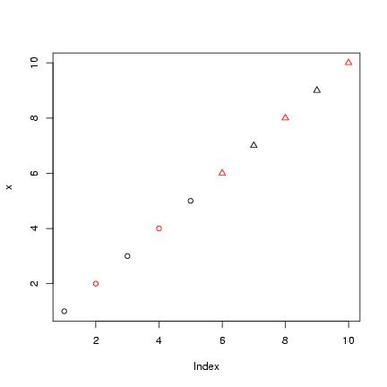
> x = 1:10
> col_vec = rep(1:2, length = 10)
> pch_vec = rep(1:2, each = 5)
> plot(x, col = col_vec, pch = pch_vec)
 Take the old tabular data (t1), log(1+x)-transform them,
and use as.numeric() to drop
all the information in tabular form
and convert them to a numeric
vector.
Plot them (plotting the data numeric vector
will generate a scatterplot of values on the
y-axis vs. observation number on the x-axis),
color-coded according to the
number available (rows) and point-type-coded
according the number taken (columns: note, there
is no color 0, so don't subtract 1).
order(x) is a function that gives a vector
of integers that will put x in increasing
order. For example, if I set x=c(3,1,2)
then order(z) is 2 3 1: putting
the second element first, the third element
second, and the first element last will
put the vector in increasing order.
In contrast, rank(x) just gives
the ranks
y[order(x)] sorts y by
the elements of x.
Redo the plot with
the data sorted in increasing order; make sure
the colors and point types match the data properly.
Does this way of plotting the data show anything
the bubbleplot didn't? Can you think of other ways
of plotting these data?
Take the old tabular data (t1), log(1+x)-transform them,
and use as.numeric() to drop
all the information in tabular form
and convert them to a numeric
vector.
Plot them (plotting the data numeric vector
will generate a scatterplot of values on the
y-axis vs. observation number on the x-axis),
color-coded according to the
number available (rows) and point-type-coded
according the number taken (columns: note, there
is no color 0, so don't subtract 1).
order(x) is a function that gives a vector
of integers that will put x in increasing
order. For example, if I set x=c(3,1,2)
then order(z) is 2 3 1: putting
the second element first, the third element
second, and the first element last will
put the vector in increasing order.
In contrast, rank(x) just gives
the ranks
y[order(x)] sorts y by
the elements of x.
Redo the plot with
the data sorted in increasing order; make sure
the colors and point types match the data properly.
Does this way of plotting the data show anything
the bubbleplot didn't? Can you think of other ways
of plotting these data?
You can use barchart() in the lattice package
to produce these graphics,
although it seems impossible to turn the graph so the
bars are vertical. Try the following (stack=FALSE
is equivalent to beside=TRUE for barplot()):
> library(lattice)
> barchart(log10(1 + table(available, taken)), stack = FALSE, auto.key = TRUE)
More impressively, the lattice package
can automatically plot a barplot of a three-way
cross-tabulation, in small multiples (I had to experiment
a bit to get the factors in the right order in the
table() command): try
> barchart(log10(1 + table(available, Species, taken)), stack = FALSE,
+     auto.key = TRUE)
Exercise 5*:
Restricting your analysis to only the observations with
5 seeds available, create a barplot showing
the distribution of number of seeds taken broken down by species.
Hints: you can create a new data set that includes only
the appropriate rows by using row indexing, then attach()
it.
2.3 Barplot with error bars
Computing the fraction taken:
> frac_taken = taken/available
Computing the mean fraction taken
for each number of seeds available,
using the tapply()
function:
tapply() ("table apply",
pronounced "t apply"), is an extension of the table()
function; it splits a specified vector into groups according to
the factors provided, then applies a function (e.g.
mean() or sd()) to each group.
This idea of applying a function to a set of objects is a very general,
very powerful idea in data manipulation with R; in due
course we'll learn about apply() (apply a function
to rows and columns of matrices), lapply() (apply
a function to lists), sapply() (apply a function
to lists and simplify), and mapply() (apply a function
to multiple lists).
For the present, though,
> mean_frac_by_avail = tapply(frac_taken, available, mean)
computes the mean of frac_taken for each group defined
by a different value of available ( R automatically
converts available into a factor temporarily for this
purpose).
If you want to compute the mean by group for more than
one variable in a data set, use aggregate().
We can also calculate the standard errors,
s/�n:
> n_by_avail = table(available)
> se_by_avail = tapply(frac_taken, available, sd)/sqrt(n_by_avail)
I'll actually use a variant of barplot(),
barplot2() (from the gplots package,
which you may need to install,
along with the
the gtools and gdata
packages) to plot these values
with standard errors. (I am mildly embarrassed that
R does not supply error-bar plotting as a built-in function,
but you can use the barplot2()
in the gplots package or the plotCI() function
(the gplots and plotrix packages have slightly
different versions).
> library(gplots)
> lower_lim = mean_frac_by_avail - se_by_avail
> upper_lim = mean_frac_by_avail + se_by_avail
> b = barplot2(mean_frac_by_avail, plot.ci = TRUE, ci.l = lower_lim,
+     ci.u = upper_lim, xlab = "Number available", ylab = "Mean number taken")
I specified that I wanted error bars plotted
(plot.ci=TRUE) and the lower (ci.l) and
upper (ci.u) limits.
2.4 Histograms by species
All I had to do to get the lattice package to
plot the histogram by species was:
> histogram(~frac_taken | Species, xlab = "Fraction taken")
It's possible to do this with base graphics, too,
but you have to rearrange your data yourself:
essentially, you have to split the data up by
species, tell R to break the plotting area
up into subplots, and then tell R to draw a histogram
in each subplot.
- To reorganize the data appropriately and
draw the plot, I first use split(), which cuts a vector into a list
according to the levels of a factor - in this
case giving us a list of the fraction-taken data
separated by species:
> splitdat = split(frac_taken, Species)
- Next I use the par()
command
> op = par(mfrow = c(3, 3), mar = c(2, 2, 1, 1))
to specify a 3 × 3 array
of mini-plots (mfrow=c(3,3)) and to reduce
the margin spacing to 2 lines on the bottom and left
sides and 1 line on the top and right
(mar=c(2,2,1,1)).
- Finally, I combine
lapply(), which
applies a command to each of the
elements in a list,
with the hist()
(histogram) command.
You can specify extra arguments in lapply()
that will be passed along to the hist() function - in this
case they're designed to strip out unnecessary detail
and make the subplots bigger.
> h = lapply(splitdat, hist, xlab = "", ylab = "", main = "", col = "gray")
Assigning the answer to a variable stops R from printing
the results, which I don't really want to see in this case.
-
par(op) will restore the previous
graphics parameters.
It's a bit harder to get the species names plotted on the
graphs: it is technically possible to use mapply()
to do this, but then we've reinvented most of the wheels
used in the lattice version ...
Plots in this section:
scatterplot (plot() or xyplot())
bubble plot (sizeplot()),
barplot (barplot() or barchart() or barplot2()),
histogram (hist() or histogram()).
Data manipulation:
reshape(), stack()/unstack(), table(),
split(), lapply(), sapply()
3 Measles data
I'm going to clear the workspace (rm(list=ls())
lists all the objects in the workspace with ls() and
then uses rm() to remove them: you can also
Clear workspace from the menu) and read in the
measles data, which are space-separated and have
a header:
> detach(data)
> rm(list = ls())
> data = read.table("ewcitmeas.dat", header = TRUE, na.strings = "*")
> attach(data)
year, mon, and day were read in as integers:
I'll create a date variable as described above.
For convenience, I'm also defining a variable with
the city names.
> date = as.Date(paste(year + 1900, mon, day, sep = "/"))
> city_names = colnames(data)[4:10]
Later on it will be useful to have the data in long
format. It's easiest to do use stack() for
this purpose (data.long = stack(data[,4:10])),
but that wouldn't preserve the date information.
As mentioned in the chapter, reshape()
is trickier but more flexible:
> data = cbind(data, date)
> data_long = reshape(data, direction = "long", varying = list(city_names),
+     v.name = "incidence", drop = c("day", "mon", "year"), times = factor(city_names),
+     timevar = "city")
3.1 Multiple-line plots
matplot() (matrix plot),
which plots several different numeric variables on a common
vertical axis, is most useful when we have a
wide format (otherwise it wouldn't make sense
to plot multiple columns on the same scale).
I'll plot columns 4 through 10, which
represent the incidence data, against the date, and I'll
tell R to use lines (type="l"), and to plot all lines
in different colors with different line types
(the colors aren't very useful since I have set
them to different gray scales for printing purposes,
but the example
should at least give you the concept). I also have to
tell it not to put on any axes, because R won't
automatically plot a date axis. Instead, I'll
use the axis() and axis.Date() commands to
add appropriate axes to the left (side=2) and
bottom (side=1) sides of the plot, and then
use box() to draw a frame around the plot.
I've used abline() to add vertical lines (v=) to
the plot every two years, and also
on 1 January 1968 (approximately when mass vaccination
against measles began in the UK). You can also use
abline() to add
horizontal lines (h=); or lines with
intercepts (a=) and slopes (b=).
(I use seq.Date(), a special command to
create a sequence of dates, to define the beginning
of biennial periods.)
legend() puts a legend on the plot; I set
the line width (lwd to 2 so you could actually
see the different colors.
Here are the commands:
> matplot(date, data[, 4:10], type = "l", col = 1:7, lty = 1:7,
+     axes = FALSE, ylab = "Weekly incidence", xlab = "Date")
> axis(side = 2)
> axis.Date(side = 1, x = date)
> vacc.date = as.Date("1968/1/1")
> biennial = seq.Date(as.Date("1948/9/1"), as.Date("1986/9/1"),
+     by = "2 years")
> abline(v = biennial, col = "gray", lty = 2)
> abline(v = vacc.date, lty = 2, lwd = 2)
> legend(x = 1970, y = 5000, city_names, col = 1:7, lty = 1:7,
+     lwd = 2, bg = "white")
> box()
I could use the long-format data set
and the lattice package to do
this more easily, although without the refinements of a date
axis, using
> xyplot(incidence ~ date, groups = city, data = data_long, type = "l",
+     auto.key = TRUE)
To plot each city in its own subplot,
use the formula incidence~date|city and omit the groups argument.
You can also draw any of these plots with different kinds of symbols
("l" for lines, "p" for points (default): see
?plot for other options).
3.2 Histogram and density plots
I'll start by just collapsing all the incidence data into a
single, logged, non-NA vector (in this case
I have to use c(as.matrix(x)) to collapse the data and remove
all of the data frame information):
> allvals = na.omit(c(as.matrix(data[, 4:10])))
> logvals = log10(1 + allvals)
The histogram (hist() command is fairly easy: the only tricks are to
leave room for the other lines that will go on the plot by
setting the y limits with ylim, and to specify that
we want the data plotted as relative frequencies, not numbers
of counts (freq=FALSE or prob=TRUE). This option
tells R to divide by total number of counts and then by the bin width,
so that the area covered by all the bars adds up to 1; this scaling
makes the vertical scale of the histogram compatible with a density plot, or among different
histograms with different number of counts or bin widths
(?? include in chapter ??).
> hist(logvals, col = "gray", main = "", xlab = "Log weekly incidence",
+     ylab = "Density", freq = FALSE, ylim = c(0, 0.6))
Adding lines for the density is straightforward, since R knows
what to do with a density object - in general, the lines
command just adds lines to a plot.
> lines(density(logvals), lwd = 2)
> lines(density(logvals, adjust = 0.5), lwd = 2, lty = 2)
Adding the estimated normal distribution
requires a couple of new functions:
- dnorm()
computes the probability density function of the
normal distribution with a specified mean and
standard deviation (much more on this in
Chapter 4).
- curve() is a magic function for
drawing a theoretical curve
(or, if add=TRUE, adding one to an existing
plot) . The magic part is
that your curve must be expressed in terms
of x; curve(x^22*x)+ will work,
but curve(y^22*y)+ won't. You can specify
other graphics parameters (line type (lty)
and width (lwd) in this case).
> curve(dnorm(x, mean = mean(logvals), sd = sd(logvals)), lty = 3,
+     lwd = 2, add = TRUE)
By now the legend() command should be reasonably
self-explanatory:
> legend(x = 2.1, y = 0.62, legend = c("density, default", "density, adjust=0.5",
+     "normal"), lwd = 2, lty = c(1, 2, 3))
3.3 Scaling data
Scaling the incidence in each city by the population size,
or by the mean or maximum incidence in that city, begins
to get us into some non-trivial data manipulation.
This process may actually be easier in the wide format.
Several useful commands:
- rowMeans(), rowSums(), colMeans(),
and colSums() will compute the means or sums of columns
efficiently. In this case we would do something like
colMeans(data[,4:10]) to get the mean incidence for
each city.
- apply() is the more general command for running
some command on each of a set of rows or columns. When you
look at the help for apply() you'll see an argument
called MARGIN, which specifies whether you want
to operate on rows (1) or columns (2). For example,
apply(data[,4:10],1,mean) is the equivalent
of rowMeans(data[,4:10]), but we can also easily
say (e.g.) apply(data[,4:10],1,max) to get the
maxima instead. Later, when you've gotten practice
defining your own functions, you can apply any function - not
just R's built-in functions.
- scale() is a function for subtracting and dividing
specified amounts out of the columns of a matrix. It is fairly
flexible: scale(x,center=TRUE,scale=TRUE) will center by
subtracting the means and then
scale by dividing by the standard errors of the columns.
Fairly obviously, setting either to FALSE will turn off
that part of the operation. You can also specify a vector for
either center or scale, in which case scale()
will subtract or divide the columns by those vectors instead.
Exercise 6*: figure out how to use
apply() and scale() to scale all columns so
they have a minimum of 0 and a maximum of 1 (hint:
subtract the minimum and divide by (max-min)).
- sweep() is more general than scale; it will
operate on either rows or columns (depending on the
MARGIN argument), and it will use any operator
(typically "-", "/", etc. - arithmetic
symbols must be in quotes) rather than just subtracting
or dividing.
For example, sweep(x,1,rowSums(x),"/") will divide
the rows (1) of x by their sums.
Exercise 7: figure out how to use
a call to sweep() to do the same thing
as scale(x,center=TRUE,scale=FALSE).
So, if I want to divide each city's incidence by its mean
(allowing for adding 1) and take logs:
> logscaledat = as.data.frame(log10(scale(1 + data[, 4:10], center = FALSE,
+     scale = colMeans(1 + data[, 4:10], na.rm = TRUE))))
You can also scale the data while they are in long format,
but you have to think about it differently.
Use tapply() to compute the mean incidence in each city, ignoring NA values,
and adding 1 to all values:
> city_means <- tapply(1 + data_long$incidence, data_long$city,
+     mean, na.rm = TRUE)
Now you can use vector indexing to scale each incidence value by
the appropriate mean value - city_means[data_long$city]
does the trick. (Why?)
> scdat <- (1 + data_long$incidence)/city_means[data_long$city]
Exercise 8*: figure out how to
scale the long-format data to minima of zero and maxima of 1.
Plotting
Here are (approximately)
the commands I used to plot the scaled data.
First, I ask R to set up the graph by plotting
the first column, but without actually putting
any lines on the plot (type="n"):
> plot(density(na.omit(logscaledat[, 1])), type = "n", main = "",
+     xlab = "Log scaled incidence")
Now I do something tricky. I define a temporary
function with two arguments - the data and
a number specifying the column and line types.
This function doesn't do anything at all until
I call it with a specific data vector and number:
x and i are just place-holders.
> tmpfun = function(x, i) {
+     lines(density(na.omit(x)), lwd = 2, col = i, lty = i)
+ }
Now I use the mapply() command
(multiple apply) to
run the tmpfun() function for all
the columns in logscaledat, with
different colors and line types.
This takes advantage of the fact that
I have used as.data.frame() above
to make logscaledat back into
a data frame, so that its columns can
be treated as elements of a list:
> m = mapply(tmpfun, logscaledat, 1:7)
Finally, I'll add a legend.
> legend(-2.6, 0.65, city_names, lwd = 2, col = 1:7, lty = 1:7)
Once again, for this relatively simple case,
I can get the lattice package to do all of this
for me magically:
> densityplot(~log10(scdat), groups = data_long$city, plot.points = FALSE,
+     auto.key = TRUE, lty = 1:7)
(if plot.points=TRUE, as is the default, the plot will include all of the
actual data values plotted as points along the zero line - this is often useful
but in this case just turns into a blob).
However, it's really useful to know some of the ins and outs for times when
lattice won't do want you want - in those cases it's often easier to do
it yourself with the base package than to figure out how to get lattice
to do it.
3.4 Box-and-whisker and violin plots
By this time, box-and-whisker and violin plots will (I hope) seem easy:
Since the labels get a little crowded ( R is not really sophisticated
about dealing with axis labels - crowded labels just disappear - although
you can try the stagger.labs() command from the plotrix
package), I'll use the substr() (substring) command to abbreviate
each city's name to its first three letters.
> city_abbr = substr(city_names, 1, 3)
The boxplot() command uses a formula - the variable before the ~
is the data and the variable after it is the factor to use to split the data up.
> boxplot(log10(1 + incidence) ~ city, data = data_long, ylab = "Log(incidence+1)",
+     names = city_abbr)
Of course, I can do this with the lattice package as well. If I want
violin plots instead of boxplots, I specify panel=panel.violin.
The scales=list(abbreviate=TRUE) tells the lattice package to
make up its own abbreviations (the scale() command is a general-purpose
list of options for the subplot formats).
> bwplot(log10(1 + incidence) ~ city, data = data_long, panel = panel.violin,
+     horizontal = FALSE, scales = list(abbreviate = TRUE))
Plots in this section:
multiple-groups plot (matplot() or xyplot(...,groups),
box-and-whisker plot (boxplot() or bwplot()),
density plot (plot(density()) or lines(density()) or densityplot()),
violin plot (panel.violin())
Data manipulation:
row/colMeans(),
row/colSums(), sweep(), scale(), apply(), mapply()
4 Continuous data
First let's make sure the earthquake data are accessible:
> data(quakes)
Luckily, most of the plots I drew in this section are
fairly automatic.
To draw a scatterplot matrix, just use pairs()
(base) or splom() (lattice):
> pairs(quakes, pch = ".")
> splom(quakes, pch = ".")
(pch="." marks the data with a single-pixel
point, which is handy if you are fortunate enough
to have a really big data set).
Similarly, the conditioning plot is only available
through lattice:
> coplot(lat ~ long | depth, data = quakes)
although coplot() has many other
options for changing the number of overlapping
categories (or shingles the data are
divided into; conditioning on more than one
variable (use var1*var2 after the vertical
bar); colors, line types, etc. etc..
To draw the last figure (various lines plotted
against data, I first took a subset of the
data with longitude greater than 175:
> tmpdat = quakes[quakes$long > 175, ]
Then I generated a basic plot of depth vs. longitude:
> plot(tmpdat$long, tmpdat$depth, xlab = "Longitude", ylab = "Depth",
+     col = "darkgray", pch = ".")
R knows what to do (plot() or lines) with
a lowess() fit. In this case I used the default
smoothing parameter (f=2/3), but I could have used
a smaller value to get a wigglier line.
> lines(lowess(tmpdat$long, tmpdat$depth), lwd = 2)
R also knows what to do with smooth.spline
objects: in this case I plot two lines, one with
less smoothing (df=4):
> lines(smooth.spline(tmpdat$long, tmpdat$depth), lwd = 2, lty = 2)
> lines(smooth.spline(tmpdat$long, tmpdat$depth, df = 4), lwd = 2,
+     lty = 3)
Adding a line based on a linear regression fit is
easy - we did that in Lab 1:
> abline(lm(depth ~ long, data = tmpdat), lwd = 2, col = "gray")
Finally, I do something slightly more complicated - plot
the results of a quadratic regression. The regression itself
is easy, except that I have to specify longitude-squared
as I(long^2) so that R knows I mean to raise
longitude to the second power rather than exploring
a statistical interaction:
> quad.lm = lm(depth ~ long + I(long^2), data = tmpdat)
To calculate predicted depth values across the range of
longitudes, I have to set up a longitude vector and
then use predict() to generate predictions
at these values:
> lvec = seq(176, 188, length = 100)
> quadvals = predict(quad.lm, newdata = data.frame(long = lvec))
Now I can just use lines() to add these
values to the graph, and add a legend:
> lines(lvec, quadvals, lwd = 2, lty = 2, col = "gray")
> legend(183.2, 690, c("lowess", "spline (default)", "spline (df=4)",
+     "regression", "quad. regression"), lwd = 2, lty = c(1, 2,
+     3, 1, 2), col = c(rep("black", 3), rep("gray", 2)))
Plots in this section:
scatterplot matrix (pairs(), splom()),
conditioning plot (coplot()),
spline (smooth.spline() and
locally weighted (lowess()) smoothing
Exercise 9*: generate
three new plots based on one of the data sets in this lab,
or on your own data.
File translated from
TEX
by
TTH,
version 3.67.
On 12 Sep 2005, 12:35.