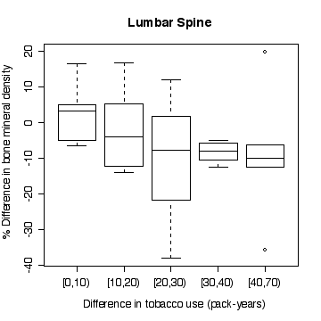
 > boxplot(split(lsc,pyrdc),xlab="Difference in tobacco use (pack-years)",ylab="% Difference in bone mineral density",main="Lumbar Spine")
Using only the clinical diagnosis as a screen, we estimate
Sensitivity = 1643/1770 = 0.9282
Specificity = 228/418 = 0.5455
Under the proposed screen, a person would have to test positive on both the clinical diagnosis and the genetic test in order to be considered positive.
|
|
|
|
|
Test + |
1076 |
66 |
|
Test - |
694 |
352 |
|
|
1770 |
418 |
Hence, Sensitivity = 1076/1770 = 0.6079
Specificity = 352/418 = 0.8421
This is an incident rate because it counts the number of new cases in a given period of time.
Let X be then number of Hispanic men out of the sample of 1000 who contract CHD during the 5-year period. If the incidence rate were 8%, X ~ Bin(1000, 0.08), so the probability of observing 100 or more cases is computed to be
> 1-pbinom(99, 1000, .08)
[1] 0.01348151
or
> pbinom(99, 1000, .08, low=F)
[1] 0.01348151
Since this number is small (at least, < 5%), we conclude that the incidence rate must be > 8% since such a large value of X would be very unusual if the incidence rate were 8%.
Rosner's answer is that Prevalence = incidence * (1 - case mortality rate), so we find
Hispanic: Prevalence = 0.10*(1 - 0.5) = 0.05
Non-Hispanic White: Prevalence = 0.08*(1 - 0.2) = 0.064
However, you might want to adjust these rates to allow for the fact that if prevalence is measured at the end of the 5-year period, you will only sample those still living, so
Hispanic: Prevalence = 0.10*(1 - 0.5)/[1 - 0.10*(1 - 0.5)]
= 0.05/0.95 = 0.0526
Non-Hispanic White: Prevalence = 0.08*(1 - 0.2)/[1 - 0.08*(1 -
0.2)] = 0.064/0.936 = 0.0684
This is a prevalence rate because it counts how many people have CHD at a given point in time. Whichever way you calculate it, the Hispanics have a lower prevalence than the Non-Hispanic Whites, despite having a higher incidence rate, because Hispanics have a higher case mortality rate.
Let X = the number of infants with major congenital malformations out of 100 offspring of Vietnam-veteran fathers. If the population malformations rate of 2.5% applies, then X ~ Bin(100, 0.025), so P(X >= 4) = 1 - P(X <= 3) is calculated as
> 1 - pbinom(3, 100, .025)
[1] 0.2410488
Since this probability is not small, we conclude that the observed rate of 4% is not inconsistent with the hypothesized rate of 2.5%, so there is no evidence from these data that offspring of Vietnam-veteran fathers have a higher rate of malformations.
Note that the Poisson approximation to the binomial works well here. If you use an approximation, be sure to state that it is an approximation. Approximations can make hand calculation easier but are not necessary if you use a computer package.
> 1 - ppois(3, 100*0.025)
[1] 0.2424239
Let X = the number of infants with major congenital malformations out of 75 offspring of mothers who used marijuana. If the population malformations rate of 2.5% applies, then X ~ Bin(75, 0.025), so P(X >= 8) = 1 - P(X <= 7) is calculated as
> 1 - pbinom(7, 75, .025)
[1] 0.0005800538
Since this probability is very small, we conclude that the observed rate of 8 out of 75, or 10.7%, is inconsistent with the hypothesized rate of 2.5%, so there is no evidence from these data that offspring of mothers who used marijuana have a higher rate of malformations.
Note that the Poisson approximation to the binomial is accurate to 3 decimal places here but has a large relative error.
> 1 - ppois(7, 75*0.025)
[1] 0.0007293296
Let X = blood-glucose level in mg/dL; we are given that, typically, X ~ N(90, 382), and a normal blood-glucose level is deemed to be the range 65-120 mg/dL. Hence the probability of being in the normal range can be computed as P(65 < X < 120)
> pnorm(120, 90, 38) - pnorm(65, 90, 38)
[1] 0.5297795
or
> pnorm((120-90)/38) - pnorm((65-90)/38)
[1] 0.5297795
so we expect 53.0% of values to fall in the "normal" range.
If "abnormal" is defined as 1.5 times the upper limit of normal, the probability of an abnormal level is P(X > 1.5*120)
> pnorm(1.5*120, 90, 38, low=F)
[1] 0.008932096
which is 0.89%.
If "abnormal" is defined as 2 times the upper limit of normal, the probability of an abnormal level is P(X > 2*120)
> pnorm(2*120, 90, 38, low=F)
[1] 3.950746e-05
If we can assume that both tests are independent, the probability that a typical person will exceed the 1.5-times limit on both tests is the square of the probability for a single test
> pnorm(1.5*120, 90, 38, low=F)^2
[1] 7.978234e-05
which is close to impossible.
Let X = the number of patients out of 6000 who exceed the 1.5-times limit on a single test; if they are typical patients and the tests are all independent, X ~ Bin(6000, 0.008932), so P(X >= 75) = 1 - P(X <= 74) is computed as
> pbinom(74, 6000, pnorm(1.5*120, 90, 38, low=F), low=F)
[1] 0.003166498
which also could be computed using the Poisson approximation to the binomial
> ppois(74, 6000*pnorm(1.5*120, 90, 38, low=F), low=F)
[1] 0.003296650
or, if a computer is not available, by the normal approximation to the binomial, with continuity correction
> p <- pnorm(1.5*120, 90, 38, low=F)
> pnorm(74.5, 6000*p, sqrt(6000*p*(1-p)), low=F)
[1] 0.002060325
or
> 1 - pnorm((74.5 - 6000*p)/sqrt(6000*p*(1-p)))
[1] 0.002060325
The probability is quite small, so the result is very unlikely to have happened by chance. Note that the normal approximation is not very close to the exact binomial calculation in this example.
> attach(boneden)
> boneden$pyrdc <- cut(pyr2-pyr1,breaks=c(0,10,20,30,40,70),right=F)
> boneden$lsc <- 100*(ls2-ls1)/((ls2+ls1)/2)
> boneden$fnc <- 100*(fn2-fn1)/((fn2+fn1)/2)
> boneden$fsc <- 100*(fs2-fs1)/((fs2+fs1)/2)
> detach(boneden)
> attach(boneden)
> plot(pyr2-pyr1,lsc,pch=zyg,col=zyg,xlab="Difference in tobacco use (pack-years)",ylab="% Difference in bone mineral density",main="Lumbar Spine")
> abline(h=0)
> legend(35,20, pch=c(1,2),col=c(1,2),legend=c("monozygotic","dizygotic"))


> boxplot(split(lsc,pyrdc),xlab="Difference in tobacco use (pack-years)",ylab="% Difference in bone mineral density",main="Lumbar Spine")
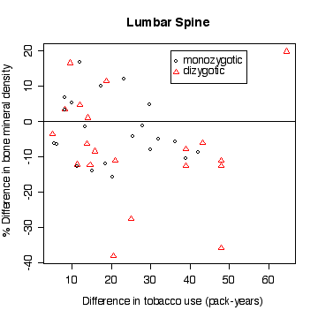
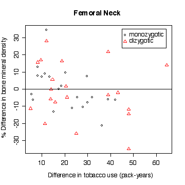
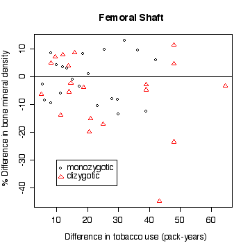
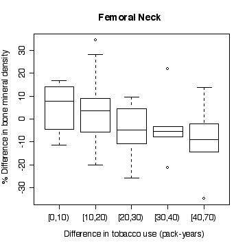
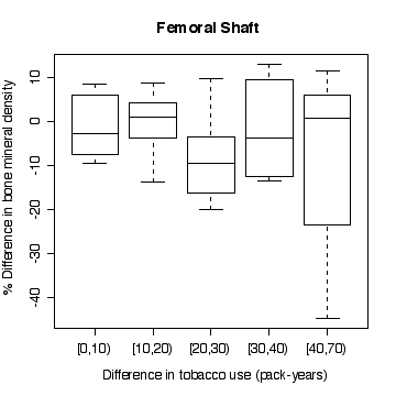
In the lumbar spine the, the more different the twins are in tobacco use, the more different they are in bone mineral density, with the heavier smoker having on average the lower density. The effect is less in femoral neck, and appears to be null in femoral shaft.
There does not appear to be a difference between monozygotic and dizygotic twins, suggesting that the effect is not genetic.
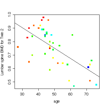
Here is an example of something else that looks interesting; it is the relationship between lumbar spine BMD and age, for the heavier-smoking twin, with pack-years coded by "rainbow" colours and the least-squares line added to show the trend. The colours go in rainbow order from red for the lowest pack-years to blue for the highest pack-years. The downward trend is strong and the lower values of pack-years (red points) tend to be with the younger smokers.
This improves on what I said about rainbow() in class. You can see how rainbow() is used here to define a palette of 10 colours, then cut() is used to categorize pyr2 into 10 levels and take the corresponding colours from the palette.
> plot(age,ls2,col=rainbow(10,start=0,end=4/6)[cut(pyr2,breaks=10)],pch=15,ylab="Lumbar spine BMD for Twin 2")
> abline(lm(ls2~age,data=boneden))
My final graph shows the rate of loss in bone mineral density with age, comparing the light smokers to the heavy smokers. You can distinguish most of the twin pairs on this plot as the points lie one above the other, being the same age.
> plot(c(20,80),c(.4,1.1),type="n",xlab="age",ylab="Lumbar spine BMD")
> points(age,ls1,col="forestgreen",pch=15)
> abline(lm(ls1~age,data=boneden),col="forestgreen",lty=2)
> points(age,ls2,col="red",pch=17)
> abline(lm(ls2~age,data=boneden),col="red")
> legend(52,1.1,pch=c(15,17),col=c("forestgreen","red"),lty=c(2,1),legend=c("Light smoker","Heavy smoker"))
I will be interested to see what plots you have done!
> names(niagara)
 [1] "station"  "date"     "julian"   "disch"    "sed"      "die.w"
 [7] "die.w.dl" "die.s"    "die.s.dl" "pcb.w"    "pcb.w.dl" "pcb.s"
[13] "pcb.s.dl"
> attach(niagara)
> plot(julian[station=="FE"],die.w[station=="FE"],type="l")
> title("Dieldrin in Water at Fort Erie")
> plot(julian[station=="FE"],die.w[station=="FE"],type="l",log="y")
> title("Dieldrin in Water at Fort Erie")
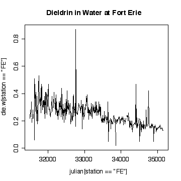
The time sequence plot shows a definite downward trend. The cycles tend to be lost in the noise, but appear to peak in winter and summer. There are occasional extreme high values, with an extreme peak on 1989-09-06. Very few of the values have been truncated at the detection limits, so that is not a problem.
I have plotted against Julian date. The result is almost the same as a plot against row index because the sampling followed a weekly schedule quite closely. If sampling was more irregular in time, the plot against Julian date would be better than the row-index plot for indicating seasonal or annual cycles.
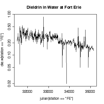
Plotting on a log scale makes the cycles a little easier to see; the ups and downs are more symmetric. On the other hand, if we are only interested in high levels of pollution, the plot in original units is perhaps more informative, the log plot puts too much emphasis on the low values.
> nfe <- length(die.w[station=="FE"])
> plot(die.w[station=="FE"][-nfe],die.w[station=="FE"][-1])
> abline(0,1)
> title("Dieldrin in Water at Fort Erie plotted Lag -1")
> plot(die.w[station=="FE"][-nfe],die.w[station=="FE"][-1],log="xy")
> abline(0,1)
> title("Dieldrin in Water at Fort Erie plotted Lag -1")
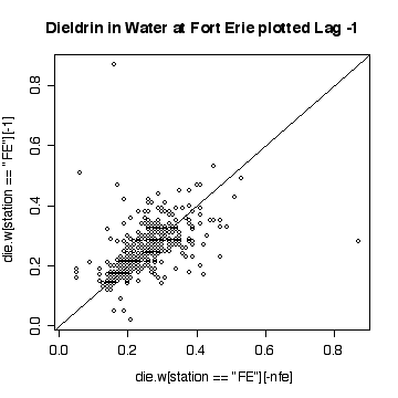
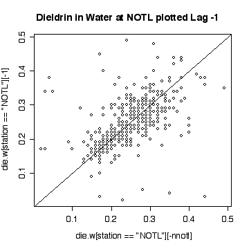
The lag-1 scatter plot indicates a strong positive autocorrelation. Note that because each point appears once on the ordinate and once on the abscissa, the single extreme peak on 1989-09-06 generates two outliers.
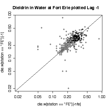
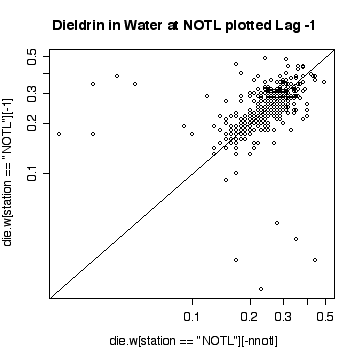
The lag-1 plot on a log scale does not give any new insights.
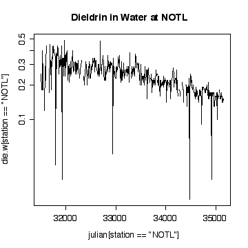
Interpretation of the Niagara-on-the Lake data is similar to interpretation of the Fort Erie data, except that the extreme values are low values and the log scale exaggerates them. Again, it does not seem helpful to use a logarithmic scale.
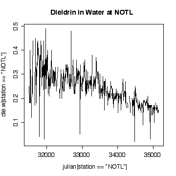
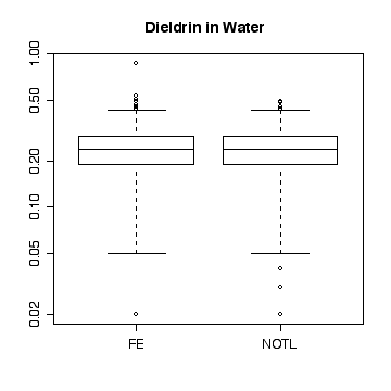
Here a few comparisons between the two stations. Because the stations are so similar and the data are so noisy, it is very difficult to detect any significant difference. The boxplots include the variation due to trend and seasonal variation, so the spread is very wide compared to any difference in median. Note that the boxplots are more symmetric on the original scale that on the log scale.
> boxplot(split(die.w,station))
> title("Dieldrin in Water")
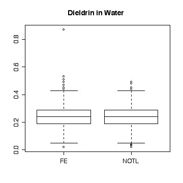
> boxplot(split(die.w,station),log="y")
> title("Dieldrin in Water")
> plot(julian[station=="NOTL"],die.w[station=="NOTL"],type="l",col="red",xlab="Julian day",ylab="Dieldrin in Water",lty=1)
> lines(julian[station=="FE"],die.w[station=="FE"],type="l",col="blue",lty=2)
> legend(33500,.5,col=c("red","blue"),legend=c("NOTL","FE"),lty=c(1,2))
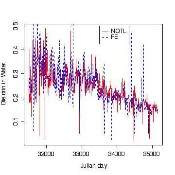
At least in the final few years, and discounting the occasional high peaks at Fort Erie, the dieldrin levels at Niagara-on-the-Lake appear to be generally above those at Fort Erie, suggesting that pollution is entering along the Niagara River,
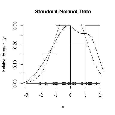
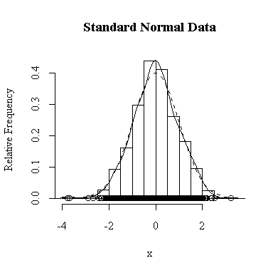
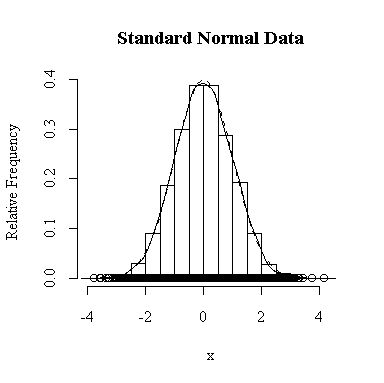
I have done this exercise for 20, 100, 1000 and 10000 observations. It is hard to say for sure, and every simulation will be different, but usually you will find that with about 100 or more observations the histogram and the density estimate give a reasonable appearance of normality. With 10000 observations the density estimate is extremely close to the true distribution, but even then the top of the peak will not be estimated perfectly.
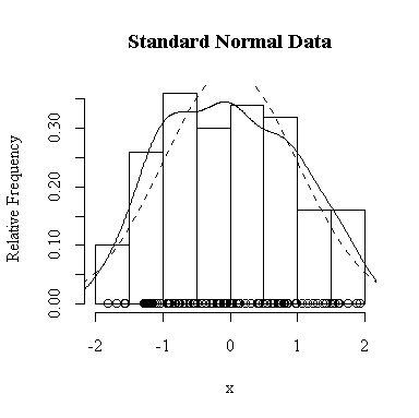
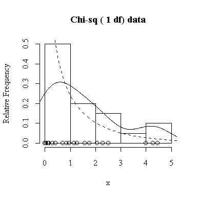
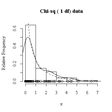
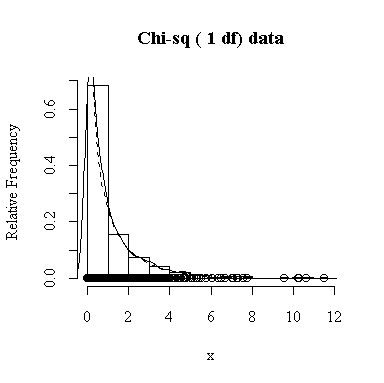
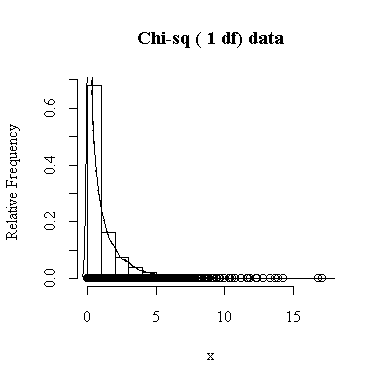
Similarly, for the chi-square distribution on 1 degree of freedom, 100 observations start to give a good representation of the shape, 10000 observations give a consistently good estimate.
To apply Equation 5.10 on p. 135, let each observation have the same mean m and the same standard deviation s and let L be the sample mean xbar. You can easily show that in this special case, E(L) = m and Var(xbar) = s 2/n.
The Central Limit Theorem, Equation 6.3 on p. 174, says that the distribution of the sample mean will be exactly normal if the data are normal, and approximately normal with large samples even if the data are not normal.
Our experience in the previous question suggests that 200 samples and 200 values of xbar will be enough to give a good indication of the sampling distribution of the sample mean.
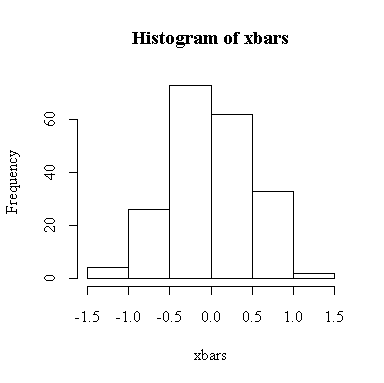
The histogram indicates normality.
For this example, n = 4 so we know E(xbar) = 0, Var(xbar) = 1/4 = 0.25, SD(xbar) = 0.5. We observed:
> mean(xbars)
[1] 0.002038315
> var(xbars)
[1] 0.2414302
> sqrt(var(xbars))
[1] 0.4913555
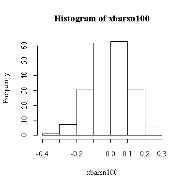
The histogram indicates normality.
For this example, n = 100 so we know E(xbar) = 0, Var(xbar) = 1/100 = 0.01, SD(xbar) = 0.1. We observed:
> mean(xbarsn100)
[1] -0.00457578
> var(xbarsn100)
[1] 0.01136128
> sqrt(var(xbarsn100))
[1] 0.1065893
> simdat <- matrix(rchisq(800,3), ncol=200)
> xbarsc4 <- apply(simdat, 2, mean)
> hist(xbarsc4)
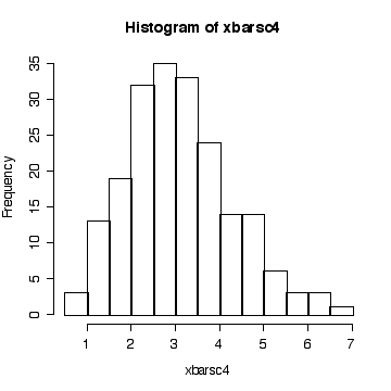
The histogram indicates that the distribution of xbar is positively skewed, albeit less skewed than the chi-square on 3 df. The sample size isn't large enough here for the central limit theorem to ensure a good approximation.
Since we know that the chi-square distribution has mean equal to the degrees of freedom and variance equal to twice the degrees of freedom, we know that when n = 4, E(xbar) = 3, Var(xbar) = 6/4 = 1.5, and SD(xbar) = sqrt(1.5) = 1.2247. We observed:
> mean(xbarsc4)
[1] 3.087669
> var(xbarsc4)
[1] 1.406587
> sqrt(var(xbarsc4))
[1] 1.185996
> simdat <- matrix(rchisq(20000,3), ncol=200)
> xbarsc100 <- apply(simdat, 2, mean)
> hist(xbarsc100)
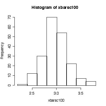
The sample size is large enough here for the central limit theorem to ensure that the distribution of the sample mean is close to a normal distribution.
Since we know that the chi-square distribution has mean equal to the degrees of freedom and variance equal to twice the degrees of freedom, we know that when n = 100, E(xbar) = 3, Var(xbar) = 6/100 = 0.06, and SD(xbar) = sqrt(0.06) = 0.24495. We observed:
> mean(xbarsc100)
[1] 2.979065
> var(xbarsc100)
[1] 0.064264
> sqrt(var(xbarsc100))
[1] 0.2535035