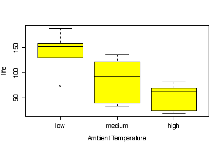
The boxplot of battery life by ambient temperature shows that battery life is longer and less variable at low temperature. This is probably something known to the experimenter, however, and the real interest is in the plate materials.
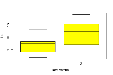
The boxplot of battery life by plate material shows that material 2 gives a somewhat longer life, but there is a lot of overlap.
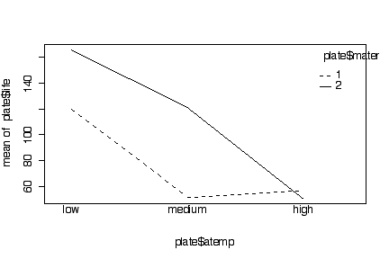
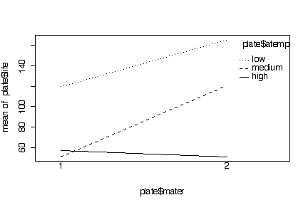
Whichever way you do the interaction plot, it is clear that at low or medium temperatures plate material 2 gives a longer average life, but at high temperature it makes no difference which of the two plate materials is used. This means that there is an interaction between ambient temperature and plate material, as the difference between the two materials is not found at all ambient temperatures. The box plots, looking at the factors one at a time, cannot show the interaction.
Since the data were given on the question paper with comma
separators, I found it faster to paste them directly into a
data.frame command in R, rather than retype the data in
Excel, save to text, and import into R. I used rep to
create the factor columns. Note that by specifying
levels=c("low","medium","high") in factor,
the levels will appear in that order in all the plots instead of
being sorted alphabetically, which would have ordered them ("high",
"low", "medium").
I used the R function interaction.plot; you could
instead use my function interactplot. You could even do
the plots partly or entirely by hand but that would take much more
time.
> plate <- data.frame(life=c(130,  74, 155,     34,  80,  40,     20,  82,  70,
   150, 159, 188,    136, 106, 122,     25,  58,  70),
   atemp=factor(rep(rep(c("low","medium","high"),c(3,3,3)),2),
    levels=c("low","medium","high")),
   mater=factor(rep(1:2,c(9,9))))
> plate
   life  atemp mater
1   130    low     1
2    74    low     1
3   155    low     1
4    34 medium     1
5    80 medium     1
6    40 medium     1
7    20   high     1
8    82   high     1
9    70   high     1
10  150    low     2
11  159    low     2
12  188    low     2
13  136 medium     2
14  106 medium     2
15  122 medium     2
16   25   high     2
17   58   high     2
18   70   high     2

> boxplot(life~atemp, data=plate, col="yellow",
   xlab="Ambient Temperature", ylab="life")
> boxplot(life~mater, data=plate, col="yellow",
   xlab="Plate Material", ylab="life")
> interaction.plot(plate$atemp, plate$mater, plate$life)
> interaction.plot(plate$mater, plate$atemp, plate$life)
Comparative box plots and conclusions: 6
marks
One or both interaction plots (created by any means) and
conclusions: 6 marks
Temperatures in the correct order from low to high (achieved by
any means): 1 mark
Quality of presentation (appearance, clarity, writing): 2 marks
Inappropriate plots: up to 4 marks
off
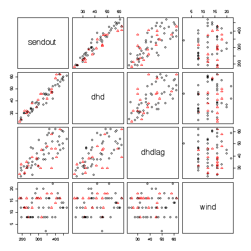
How well the various covariables (degree heating days, lagged degree heating days, and wind speed) predict the demand for natural gas (sendout) seems to be more interesting than how the demand varies from day to day, so I began with a pairs plot, coding the points by weekend versus weekday. There is a strong linear relationship between sendout and dhd, and a weaker linear relationship between sendout and lagged dhd. The weekend points (red triangles) tend to lie very slightly below the weekday points (black circles) on the plot of sendout against dhd, indicating that the demand is very slightly less on weekends for any given dhd. Wind speed does not appear to be related to sendout or to dhd. If we wanted to study the effect of wind speed we would therefore have to examine the variables three at a time, the pairs analysis is not adequate.
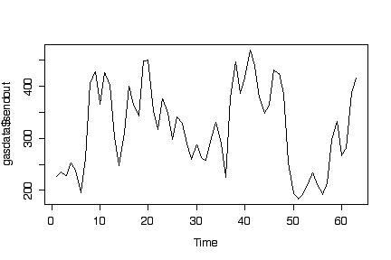
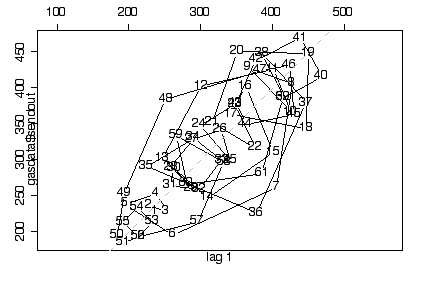
It may be worth exploring the time series for sendout. The time series plot shows oscillations and the lag plot indicates some autocorrelation.
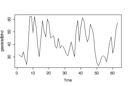
The time series plot for dhd looks much like the time series plot for sendout. The lag plot has already been done in the pairs plot (dhd versus dhdlag) and does not need to be repeated here; it indicates some autocorrelation in the dhd series.
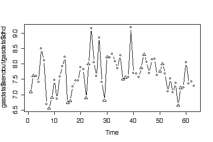
Since sendout and dhd are closely linearly related, it may be worth looking at their ratio, as it may give a less variable time series than either variable alone. This seems to be the case. Weekends (coded by triangles) tend to have lower ratios than weekdays.
> gasdata <- read.table("gasdata.txt", head=T)
> gasdata$weekend <- as.factor(gasdata$weekend)
> pairs(gasdata[,-5], col=as.numeric(gasdata$weekend), pch=as.numeric(gasdata$weekend))
> ts.plot(gasdata$sendout)
> lag.plot(gasdata$sendout)
> ts.plot(gasdata$dhd)
> plot(gasdata$sendout/gasdata$dhd, type="b", pch=as.numeric(gasdata$weekend), xlab="Time")
Pairs plot and interpretation: 8
marks
Any appropriate analysis of the various time series: 8 marks
Anything else (box plots, histograms or other univariate
analyses): 2 marks
Quality of presentation (appearance, clarity, writing): 2 marks
Inappropriate plots: up to 4 marks
off